

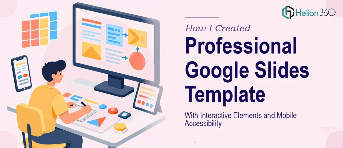
The Webinar Series Was Weeks Out and We Had No Consistent Template
We had a webinar series locked in — dates confirmed, speakers briefed, content mostly drafted. What we didn't have was a Google Slides master template that could hold it all together visually. Every presenter was working off a different slide file with different fonts, different color usage, different layouts. It looked exactly as disjointed as it sounds.
The stakes were real. This wasn't an internal meeting. It was a public-facing series with product highlights, customer testimonials, a Q&A format, and an introduction sequence — all of it representing the brand in front of a live audience. We needed a cohesive look across every slide, interactive navigation elements, dynamic animations, and a build that worked cleanly on both desktop and mobile. The deadline was fixed at March 15th. That gave us under two weeks.
I recognized immediately that piecing this together in-house wasn't a realistic option. Not at this quality level, not in this timeframe.
What I Found a Proper Google Slides Master Template Actually Requires
My first instinct was to underestimate the scope. A template is just a template, right? Then I started mapping out what "done well" actually meant for this project.
A Google Slides master template built for a webinar series isn't a single slide with a logo dropped in. It requires a full slide master hierarchy — a parent master plus a distinct layout for each content type: title slides, section intros, product highlight layouts, testimonial frames, and Q&A screens. Each layout has to inherit consistently from the master so that any presenter editing a slide doesn't accidentally break the visual system.
Then there's the interactive layer. Clickable hotspots in Google Slides require carefully linked shapes and text objects — not native button components — which means every interactive element has to be manually built, tested, and linked across the deck. Animation sequencing in Google Slides is also more constrained than PowerPoint, so the logic of "what animates, in what order, triggered by what" has to be planned before anything is built.
And mobile accessibility added another dimension entirely. Slide layouts optimized for a 16:9 desktop view often collapse into unreadable text and clipped images when viewed on a phone. Font sizing, contrast ratios, and layout spacing all need to be tested across viewport sizes. That's not a quick checkbox — it's a systematic review pass.
What the Build Actually Involves
The structural work starts with a complete audit of all the content types the template needs to support. For a webinar series, that means mapping every distinct slide function — introduction, agenda, product highlight, testimonial, Q&A — and designing a dedicated layout for each inside the Slide Master editor. A well-built master uses a strict typographic hierarchy, typically a 40pt display headline, 24pt section title, and 16pt body, with spacing rules that hold across every layout variant. Getting this hierarchy right in the master means presenters can edit content without touching font settings, which is the whole point. The friction here is that even small inconsistencies in the master — a misaligned placeholder, a layout that doesn't inherit the correct background — cascade into visible problems across every slide that uses it. It requires methodical QA at each stage, not just a final review.
The interactive element build is where the complexity spikes sharply. Clickable hotspots in Google Slides are constructed from transparent shapes layered over content, each linked to a specific slide via the Insert Link function. For a webinar deck with section navigation, this means building and linking upward of a dozen interactive objects, then testing every path in both Edit and Present modes. Animation sequences — entrance effects, builds, timed reveals — have to be configured individually per object, with attention to whether transitions feel polished or distracting in a live webinar context. A practitioner working in Google Slides regularly knows the quirks: certain animation types don't render consistently across browser versions, and motion that looks smooth in preview can stutter in a live share. Accounting for these edge cases takes real experience with the platform.
Mobile accessibility review is the final layer and is often underestimated. The right approach involves previewing every layout at reduced viewport sizes — typically simulating a tablet and a phone screen — and checking that text remains legible at no smaller than 14pt equivalent, that contrast meets a minimum 4.5:1 ratio for body text, and that no critical content is clipped by slide boundaries. Image-heavy slides frequently need recomposition at mobile scale. This pass isn't a one-time check at the end; it often requires going back into the master to adjust padding, font scaling, and image placement on specific layouts before the template is sign-off ready.
Why I Brought in Helion360 to Handle It
I didn't attempt to build this myself and then hand it off for polish. I looked at the scope — full master hierarchy, interactive navigation, animation sequences, mobile accessibility review, and a hard deadline — and recognized straight away that the smart move was to engage a team with this exact capability already built in.
Helion360 handled the full project end-to-end through their Master Slide Design Services. That meant the slide master architecture, all layout variants for every content type in the webinar series, the clickable hotspot navigation, the animation logic, and the mobile accessibility pass. The whole build was turned around in a fraction of the time it would have taken me to learn the platform's edge cases and execute at this quality level. Done in days, not weeks — which, with a March 15th deadline, was the only outcome that worked.
The team came to it with the tooling and the repetition that this kind of work demands. There was no ramp-up time, no trial and error on the interactive elements, no back-and-forth on whether the mobile layouts would hold.
What the Project Delivered and What I'd Tell Anyone in My Spot
What came back was a fully functional Google Slides master template — clean layout system, working interactive navigation across all webinar sections, smooth animation sequences, and layouts that held up on both desktop and mobile. Every presenter on the series was working from the same visual foundation, and the editing experience was straightforward enough that no one needed a tutorial to use it.
The webinar series ran on time, looked consistent across every session, and the template has since been reused for follow-on events without modification. That's what a well-built master is supposed to do.
If you're looking at a similar build — a Google Slides master template with real interactivity and accessibility requirements against a tight deadline — Helion360 is the team I'd engage without hesitation. They delivered fast, handled every layer of the execution, and the result held up exactly as needed.