

The Assignment Was Bigger Than It First Appeared
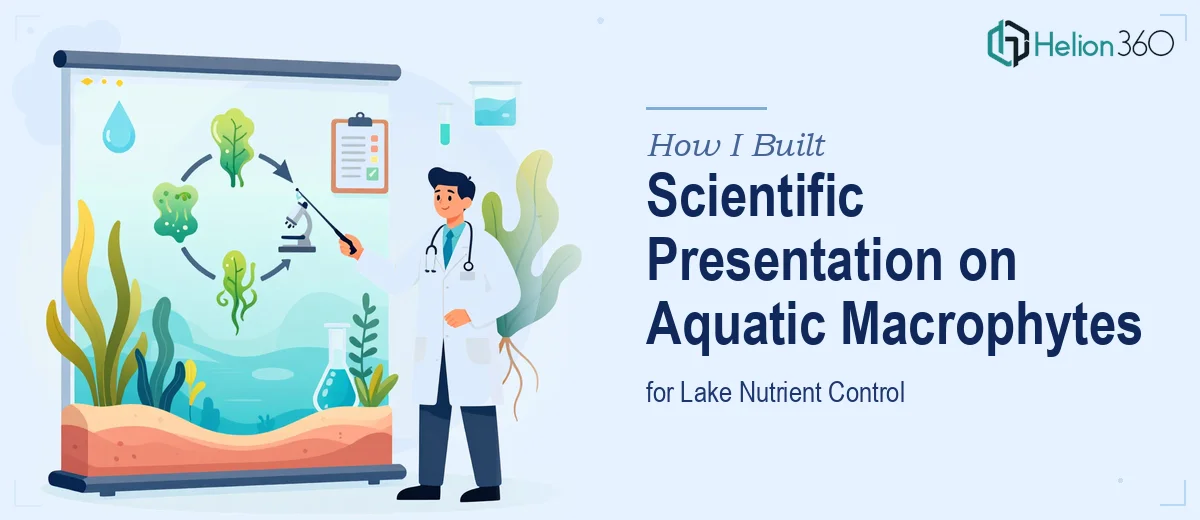
When I took on a project to build a scientific PowerPoint presentation on aquatic macrophytes and their role in controlling phosphorus and nitrogen levels in lakes, I thought I had a clear path forward. I had access to research papers, a basic understanding of the subject, and a good grasp of PowerPoint. A few days of focused work, I figured, and it would be done.
I was wrong about the timeline — and about the complexity.
The scope kept expanding as I dug deeper. The presentation needed to cover macrophyte species diversity, their life cycles, habitat preferences, and how they physically absorb and retain phosphorus and nitrogen. It also needed real case studies, a comparison with other lake management strategies, and a discussion of the limitations and potential drawbacks of using macrophytes as a primary remediation tool. On top of the scientific content, the slides had to be visually engaging — charts, ecosystem diagrams, data comparisons, and properly cited research all had to live together in a coherent flow.
Where the Research Presentation Got Complicated
The content itself was dense. Phosphorus and nitrogen dynamics in aquatic ecosystems involve a lot of moving parts — sediment release, plant uptake rates, seasonal variation, and interactions with algae and other organisms. Writing about this accurately while keeping slides readable for a mixed audience of scientists and environmental policymakers is a genuine design and communication challenge.
I started by drafting the structure: an introduction to eutrophication and why nutrient management matters, followed by sections on emergent, submerged, and floating macrophyte species. I mapped out how each category contributes differently to P and N retention in water bodies. I pulled studies on species like Phragmites australis, Typha latifolia, and Myriophyllum spicatum. The raw material was there, but turning it into something presentation-ready — with clear visual hierarchy, properly labeled charts, and a consistent scientific tone — was a different kind of work entirely.
The comparison section was especially tricky. Laying out macrophyte-based nutrient control against chemical precipitation, constructed wetlands, and algal management in a way that was fair, data-backed, and visually clean required chart design skills I was not fully equipped to execute at the level this presentation needed.
Bringing in the Right Support
After hitting that wall, I reached out to Helion360. I explained the project — the scientific subject matter, the audience, the visual expectations, and the citation requirements — and their team took it from there.
What impressed me was how methodically they approached it. They did not just reformat the slides I had drafted. They restructured the narrative flow so that the data built logically from the ecology of macrophytes to their practical application in lake management. The case study slides were redesigned to highlight outcomes clearly — things like percentage reductions in phosphorus concentration across documented field studies and timelines for measurable water quality improvement.
The comparison charts came out particularly well. Instead of cluttered tables, they used clean visual frameworks that made it easy to see where macrophyte-based approaches outperformed alternatives and where they fell short — which mattered for the section on limitations and real-world constraints.
What the Final Presentation Delivered
The completed deck covered the full scope the project required. It walked through the ecological mechanisms by which aquatic plants uptake and retain phosphorus and nitrogen, with accurate references to peer-reviewed sources. It included slide sequences on specific macrophyte species, their seasonal behavior, and how habitat conditions affect their effectiveness. The case studies drew from documented lake restoration projects in Europe and North America, with outcome data visualized in a format that was easy to follow without oversimplifying the science.
The section on economic and environmental benefits came together more clearly than I had managed on my own. When you can show not just that macrophytes work, but why they are cost-effective relative to mechanical or chemical alternatives over a multi-year horizon, the argument for using them as a management strategy becomes much more persuasive.
I came away from this project with a better understanding of what goes into a serious scientific research presentation — not just the content, but the communication architecture underneath it.
If you are working on a similarly dense research presentation and finding that the content and the design are pulling in different directions, consider market research presentation design services — they are set up to handle exactly that kind of complexity. You might also find it helpful to review how others have tackled data visualization and slide design challenges, or explore the process of building comprehensive data analysis reports that inform strategic presentations.