

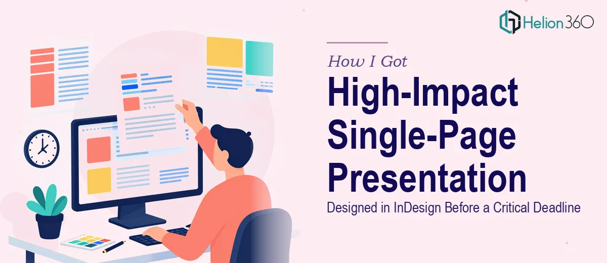
The Stakeholder Meeting Was Days Away and the Pressure Was Real
I had a critical stakeholder meeting on the calendar with no room to move it. The ask was a single-page presentation — one page that had to carry the full weight of the message, look completely polished, and communicate complex information clearly to a senior audience. That kind of constraint sounds simple until you realize that compressing everything into a single page actually raises the design bar considerably. There's no second slide to catch the overflow. Every element on that page has to earn its place.
The content involved infographics, supporting charts, and a significant amount of text — all of which needed to feel cohesive rather than crowded. The theme and layout were partially defined, but translating a concept into a finished InDesign file with that level of precision wasn't something I was going to figure out in the days I had left. I knew immediately this needed to be handled by someone who works in this environment professionally.
What I Found This Kind of Work Actually Requires
Once I started looking at what a well-executed single-page InDesign presentation actually involves, it became clear quickly that the tool itself is only part of the story. InDesign is a production-grade layout application — it's not a drag-and-drop environment. The way text frames, object styles, paragraph styles, and master page elements interact requires real working knowledge of the software, not a passing familiarity with it.
Beyond the tool, a single-page design for a stakeholder audience has its own visual logic. The layout has to establish hierarchy — primary message, supporting data, context — in a way the eye can follow without confusion. With charts and infographics also in the mix, there are layered decisions about how each element relates to the others spatially and visually.
The third signal that this wasn't a weekend project: InDesign files intended for professional output need to be built correctly from the start. Improperly linked assets, incorrect color profiles, or inconsistent spacing become very difficult to fix once the layout is set. Doing it right the first time requires building the file the way a production-ready document is meant to be built.
What Proper Execution of This Work Actually Looks Like
The right approach to a single-page InDesign presentation starts with structure. The work involves auditing the content — every text block, data point, and visual element — and mapping it against a layout grid before a single frame is placed. A standard approach uses a 12-column grid with defined margin and gutter values, which gives the designer a consistent spatial system to work within. This structural phase sounds administrative, but it's where most of the visual logic is decided. Without it, elements end up placed by feel rather than by system, and the result looks assembled rather than designed. Getting this right takes genuine layout experience and typically several hours of deliberate planning.
Visual mechanics — how the charts and infographics are built and integrated — represent the second major layer of work. Charts intended for a stakeholder audience need to communicate a specific point, not just display data. The decision a practitioner makes here is which chart type matches the story each dataset tells, then ensuring the chart is built at the correct resolution and color profile for the final output format. Infographics follow similar rules: icon weight, line thickness, and color usage need to stay within a tight system — typically no more than four brand colors — so the page reads as unified rather than visually noisy. These decisions require both design judgment and technical accuracy.
Polish and consistency across every element on the page is the third layer, and it's where a lot of otherwise decent work falls apart. Paragraph styles need to enforce a clear typographic hierarchy — a common standard uses a 36pt primary heading, 24pt secondary label, and 16pt body — applied consistently so the eye moves through the page in the right sequence. Color usage, spacing, and alignment need to be governed by the same rules across every element, from the smallest caption to the largest chart title. In a single-page format, any inconsistency is immediately visible because there's nowhere for it to hide. Achieving this level of finish requires both an eye for detail and the patience to audit every element before the file is considered done.
Why I Brought Helion360 in to Handle the Full Project
I didn't spend time attempting to work through this myself. The combination of a hard deadline, a high-stakes audience, and the production depth the work required made the decision straightforward — I needed a team that does this kind of work every day and already has the tooling and expertise in place.
Helion360 handled the project end-to-end: taking the initial concept and layout direction, building the full InDesign file with all the infographics and charts integrated, and delivering a production-ready output. The work was turned around quickly — done in days, not weeks — which was exactly what the deadline required. What would have taken me a significant stretch of learning curve and trial-and-error was handled in a fraction of that time by a team for whom this is standard operating procedure. The brief was understood clearly from the start, and the execution matched the precision the stakeholder context demanded.
What the Delivered Work Made Possible — and What I'd Tell Anyone in the Same Spot
The finished one-page presentation went into the stakeholder meeting looking exactly like what it needed to be: professional, cohesive, and visually clear. The charts read correctly, the infographics reinforced the narrative rather than competing with it, and the layout directed attention in the right sequence. The meeting had the material it needed, and the presentation held up under the scrutiny a senior audience brings.
If you're looking at a similar situation — a hard deadline, a high-stakes audience, and a single-page InDesign presentation that needs to be built correctly and look genuinely polished — Helion360 is the team I'd engage. They delivered fast, handled the full execution depth this work requires, and made the tight turnaround entirely manageable.