

The Problem with Presenting Market Research Findings
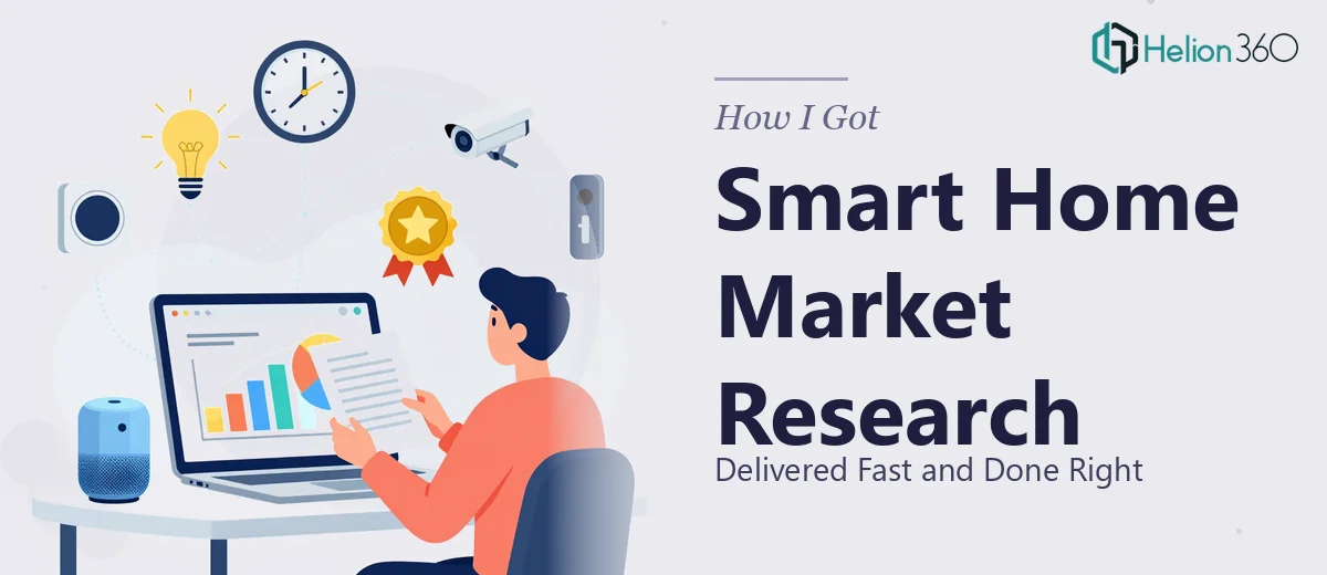
I had a deadline, a room full of stakeholders, and a pile of raw market research data about smart home assistant adoption across key regional markets. The ask was straightforward on the surface: turn this location and expansion research into a presentation that could drive a real business decision.
What made it less straightforward was the stakes. This wasn't a status update — it was the foundation for a geographic expansion recommendation for a next-generation smart home product. The audience included people who would fund or kill the direction based on what they saw on those slides. Getting the data wrong, or presenting it in a way that muddied the insight, wasn't an option.
I quickly recognized that doing this well wasn't a matter of dropping charts into a slide deck. The data was complex, the narrative had to hold up under scrutiny, and the visual treatment needed to match the caliber of the decision being made. I needed the right team on it.
What I Found a Market Research Presentation Actually Requires
When I looked at what a polished, decision-ready market research presentation genuinely involves, a few things stood out immediately as signals of real complexity.
The first was the data-to-story translation problem. Raw location research — demographic overlays, market sizing by region, competitive saturation indices — doesn't arrive pre-structured for a business audience. Someone has to decide which findings belong in the executive narrative and which belong in an appendix. That editorial judgment is not a small task.
The second was the visualization challenge. Market research data typically includes multiple data types: geographic comparisons, trend lines over time, indexed scores across locations. Each data type calls for a different chart structure. Choosing the wrong one doesn't just look bad — it actively misleads the reader.
The third signal was consistency and depth. A credible research presentation isn't five slides with a few bar charts. Done properly, it runs 20-35 slides, with consistent visual logic and a clear hierarchy between primary findings, supporting evidence, and methodology. That scope requires both design expertise and subject-matter familiarity — and I had a week to deliver it.
What the Work to Build This Actually Involves
The Real Work Behind a Research-Grade Presentation
The structural work starts with an audit of the source research and a deliberate mapping of the narrative arc. A well-built market research presentation follows a clear logic: it opens with the core question, moves through the evidence, and closes with a recommendation the audience can act on. That architecture has to be established before a single slide is designed. Source documents often contain findings that are analytically valid but narratively redundant — a practitioner working through this has to make disciplined decisions about what drives the story forward and what gets moved to an appendix. Getting this wrong at the outline stage means the entire presentation argues against itself by the time it reaches the room.
The visual mechanics layer is where complexity compounds. Each data type in a location research project — indexed market attractiveness scores, regional comparison matrices, trend data over multiple periods — has a chart form best suited to it. The rule of thumb in professional research presentation design is one insight per slide, with chart labels set no smaller than 14pt for readability and a maximum of three data series per visual before a second slide is warranted. Applying these rules consistently across 25-plus slides while preserving a coherent layout grid — typically a 12-column structure with uniform margin discipline — takes hours of careful execution even for someone experienced with the tooling.
Polish and brand consistency across the full deck is the step that distinguishes a presentation that looks like research from one that feels like a document. A properly branded research presentation holds to a maximum of four colors drawn from the brand palette, uses a strict typographic hierarchy — 36pt for slide titles, 24pt for section headers, 16pt for body — and applies the same spacing logic to every slide, including the appendix. The execution friction here is real: even one slide that breaks the grid or introduces an off-palette color undermines the visual authority of the whole document. Maintaining this discipline across a long, data-heavy deck is exactly the kind of detail that falls apart under time pressure.
Why I Brought in Helion360 to Handle It
I didn't spend time trying to build this myself. The combination of narrative complexity, data visualization depth, and brand polish required — across a tight timeline — made it obvious that this needed a team with the expertise and tooling already in place.
Helion360 handled the full project end-to-end. That meant taking the raw research output, structuring the narrative arc, selecting and building the appropriate visualization types for each finding, and applying consistent design discipline across every slide. I didn't hand them a half-finished deck to clean up — I handed them the source material and they delivered a complete, presentation-ready document.
What stood out was the speed. The full build was turned around in a fraction of the time it would have taken me to work through the learning curve on both the analytical structuring and the design execution. Done in days, not weeks — and done to the standard the audience expected.
What Was Delivered and What I'd Tell Anyone in the Same Position
What came back was a 28-slide market research presentation that moved cleanly from the strategic question through the regional data, competitive context, and expansion recommendation. The visualization choices were deliberate — geographic comparison data rendered as indexed heat maps, trend data as clean line charts with properly labeled axes, and summary findings formatted as structured insight cards rather than text-heavy bullets. The stakeholder meeting moved efficiently because the story in the slides was clear.
Anyone looking at a similar project — complex research data, a high-stakes audience, and a realistic deadline — will quickly see that the path of least resistance is not attempting to build this yourself. If you're in that position and want market research presentation design services handled end-to-end without the weeks of learning curve, consider how turning complex market research into a compelling business presentation requires the right expertise — Helion360 delivered fast, and the execution depth matched exactly what this kind of work requires. For similar challenges with emerging markets or complex data sets, teams that specialize in research-heavy presentations delivered fast understand the structural and visual depth required.