

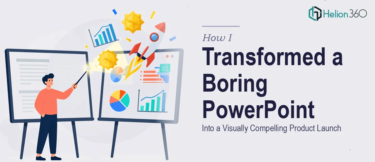
When Great Content Gets Buried in Bad Slides
We had a conference coming up in less than two weeks. The script was solid, the product was ready, and the team was energized. The one thing that wasn't ready was the presentation itself.
I opened the PowerPoint file and immediately felt the problem. Slide after slide of plain text — bullet points stacked on bullet points, no visual hierarchy, no graphics, no breathing room. For a tech startup preparing to launch a new software product at a major industry event, it looked more like a draft document than a stage-ready deck.
I knew we needed a serious presentation redesign. The question was whether I could pull it off myself in time.
What I Tried Before Asking for Help
I started by working through the slides myself. I swapped out the default PowerPoint theme, tried adding some stock images, and attempted to restructure a few of the denser text slides. It helped a little, but not nearly enough.
The core issue wasn't just aesthetics — it was that the slides needed to tell a visual story. Each section of the product launch needed its own visual language: a problem slide that felt urgent, a solution slide that felt clean and confident, a product feature breakdown that was easy to scan at a glance. Getting that right required more than a template swap.
I also ran into branding consistency issues. We had brand colors and a logo, but applying them uniformly across 30-plus slides while maintaining good design balance was harder than it sounds. Every time I fixed one slide, something looked off on another.
After two days of late nights and incremental progress, I accepted the reality: I was good at the content side, but this level of visual storytelling in PowerPoint was beyond what I could execute cleanly under deadline.
Handing It Over to a Design Team
A colleague mentioned Helion360, and after looking at their work I sent over the file along with our brand guidelines and a brief explaining the conference context. I was upfront about the timeline.
Their team asked a few clarifying questions — about tone, audience, the key messages we needed each section to land — and then got to work. What came back wasn't just a polished version of what I'd built. It was a structurally rethought presentation.
What the Redesigned Deck Actually Looked Like
The Helion360 team approached the redesign systematically. Heavy text slides were broken into focused layouts where the headline did the heavy lifting and supporting visuals reinforced the point rather than decorating it. Product features were visualized using custom icons and clean section dividers instead of plain lists.
The data slides — which had originally been raw numbers in text form — were turned into simple, readable charts and infographics that made the numbers feel meaningful in context. The product workflow, which had been described in a paragraph, became a step-by-step visual flow that an audience could follow even from the back of a room.
Brand consistency was handled throughout. The colors, typography, and logo placement were applied with a precision I hadn't managed on my own. Every slide felt like it belonged to the same family.
The overall result was a presentation that felt designed for the stage — not drafted for a meeting room.
What I Took Away From This
The experience clarified something for me. Writing strong content for a presentation and designing a strong presentation are two genuinely different skills. The script I had written was doing its job. What it needed was a visual layer that could carry the message to an audience who would be watching slides from across a conference hall, not reading them at a desk.
Professional presentation design — especially for something like a product launch presentation — involves decisions about layout, pacing, visual hierarchy, and brand application that go well beyond knowing how to use PowerPoint. It takes experience with what actually works on screen.
If you're working on a product launch presentation and hitting the same wall — great content but slides that don't do it justice — Helion360 is worth reaching out to. They took our text-heavy file and turned it into something we were genuinely proud to put on a conference screen.