

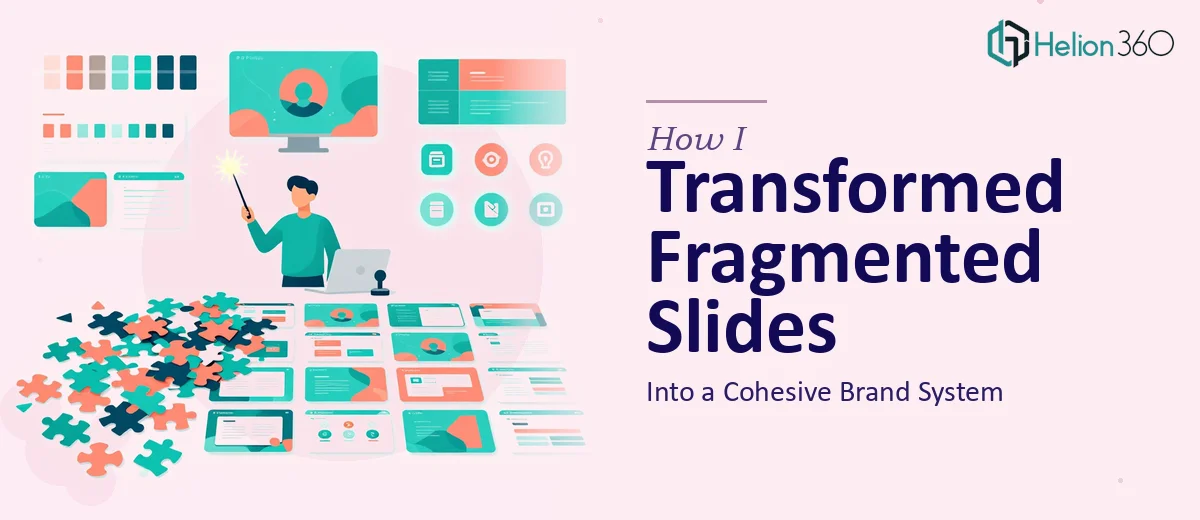
The Problem With Our Slide Library Was Bigger Than It Looked
We'd built up a sizable library of PowerPoint presentations over the past couple of years — decks for client pitches, internal updates, campaign reports, and new business proposals. The problem was that each one had been put together in isolation, usually under deadline pressure, by whoever had the bandwidth at the time. The result was a fragmented mess: three different font treatments across five decks, inconsistent logo placement, color values that were close to our brand palette but not quite right, and slide layouts that looked nothing like each other.
We were a digital marketing agency. The quality of our presentations was a direct reflection of our credibility. Walking into a pitch with mismatched slides wasn't just an aesthetic problem — it was a trust problem. I knew this needed to be fixed properly, not patched. And I knew it wasn't something I could spend two weeks figuring out on my own.
What I Found Reformatting Slides to Brand Guidelines Actually Requires
Before I did anything, I spent some time understanding what a proper PowerPoint brand alignment project actually involves. What I found surprised me in terms of scope.
The first thing that became clear was that this wasn't a cosmetic pass. Reformatting slides to brand guidelines means establishing a master slide architecture — the kind that controls every layout variant, every font size, every spacing rule from a single source of truth. If that's not built correctly at the master level, every individual slide becomes a manual fix.
The second signal of complexity was color. A brand palette in a style guide is a set of hex values. In PowerPoint, those values have to be applied to a custom theme color scheme so they propagate accurately across fills, text, borders, and charts — consistently, without drift. Getting that mapping right requires someone who knows exactly where PowerPoint stores and references theme colors.
The third thing I noticed was that existing slide content doesn't just drop cleanly into a new template. Reformatting means auditing every slide, resolving layout conflicts, and adjusting text blocks, image placements, and data visuals one by one. The surface area of the work grows with every slide in the library.
What the Work Itself Actually Involves
The foundation of any brand-aligned PowerPoint system is the slide master. Proper master slide architecture means building a hierarchy of layouts — typically a primary master with 8 to 12 layout variants — where typography, color, and spacing rules cascade down automatically. The font hierarchy applied at this level usually runs something like 40pt for titles, 24pt for subheadings, and 16pt for body text, all tied to the brand's specified typefaces. The work involves setting this up so that any slide created from the template inherits the correct style without manual intervention. For someone unfamiliar with how PowerPoint's slide master inheritance actually functions, this step alone can consume days of trial and error before it behaves predictably.
Once the master is established, the visual mechanics of individual slides need to be resolved. This means applying a consistent layout grid — often a 12-column structure with defined margin widths and content safe zones — so that text blocks, images, icons, and data visuals land in the same spatial logic across every slide. Brand color values need to be entered precisely into the theme color palette, and no more than four primary brand colors should populate the core theme slots to avoid visual noise. Charts and data visuals require particular attention: axis labels, gridline weights, and data series colors all need to be remapped to brand values individually, since they don't inherit from the master the way text and shapes do. This stage of the work is where most DIY attempts break down — the grid looks right until it doesn't, and tracking down the inconsistency slide by slide is painstaking.
The final layer is consistency enforcement across the full slide library. Every existing deck needs to be audited against the new template, with layout conflicts resolved, logo placements standardized, and any off-brand color or typography instances corrected. A realistic brand-compliant library also accounts for edge cases: slides with dense data tables, slides with full-bleed photography, slides that carry legal or regulatory copy in a smaller type size. Each exception needs a defined solution within the brand system, not a one-off workaround. Across a library of any meaningful size, this audit and correction pass is the most time-intensive phase — and the one where accumulated errors compound fastest if discipline slips.
Why I Brought in Helion360 to Handle It
Looking at the full scope of what proper PowerPoint brand alignment requires, I made a straightforward call. I didn't have weeks to spend learning slide master architecture, and attempting a partial fix on a presentation library this size would have created as many problems as it solved. The right move was to engage a team that does this work every day with the tooling and process already in place.
Helion360 handled the full project end-to-end — built the master slide system from scratch against our brand identity, applied the theme color palette correctly across every layout, and audited and reformatted the existing deck library to match. They turned it around quickly, in a fraction of the time it would have taken me to learn and execute it myself. What I got back was a clean, fully structured PowerPoint template with consistent layouts, correct color mapping, and a slide library that finally looked like it came from the same organization.
The Outcome and What I'd Tell Anyone Facing the Same Situation
The difference between what we had before and what we had after was immediately visible. Client presentations looked cohesive and deliberate. Internal decks followed the same logic. New slides built from the template came out correctly styled without any manual cleanup. The agency looked like the brand it was trying to sell.
The deeper value wasn't just the visual upgrade — it was the system. Having a master slide architecture means every future presentation starts from the right foundation instead of drifting back into the same fragmented state.
If you're looking at a similar situation and want it handled end-to-end without the weeks of learning curve, Helion360 is the team I'd engage — they delivered fast and brought the execution depth this kind of work genuinely requires.