

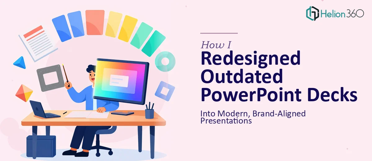
The Decks Were Outdated and a Key Deadline Was Coming
I had several PowerPoint presentations that hadn't been touched in years. The content was solid, but the visual execution was stuck in a previous era — mismatched fonts, inconsistent color usage, cluttered slides that didn't reflect where the company was today. These weren't internal-only decks. They were going in front of clients and stakeholders, and the impression they made mattered.
The deadline was real: presentations needed to be ready within the week. Showing up with slides that looked that dated wasn't an option. I knew a proper PowerPoint redesign wasn't just about swapping colors or applying a new template — it meant auditing what existed, building a coherent visual system, and making every slide earn its place. That level of work needed to be done right, and it needed to be done fast.
What I Found a Real Presentation Redesign Actually Requires
Once I started looking into what a proper PowerPoint redesign involves, it became clear this wasn't a light editing job. The scope of real redesign work surprised me.
First, every existing deck needs a content audit before a single slide is touched. That means evaluating which slides communicate clearly, which carry redundant or misplaced content, and which need to be restructured from the ground up. That alone takes time and judgment.
Second, brand alignment in a presentation isn't just applying a logo. It means defining and enforcing a type hierarchy — typically a three-level system like 36pt headers, 24pt subheadings, and 16pt body — pulling an exact color palette from brand guidelines, and ensuring those rules hold consistently across every master slide.
Third, visuals like charts, icons, and images can't just be dropped in. Each element needs to be properly sized, labeled, and styled to match the deck's visual language. An image that's slightly off-brand or a chart using default Excel colors can quietly undermine an otherwise strong slide. I saw quickly that doing all of this well, across multiple decks, in a week, was not something I could handle on my own.
The Work That Actually Goes Into a Modern PowerPoint Redesign
The right approach to a PowerPoint redesign starts at the structural level, before any visual decisions are made. A practitioner audits each deck slide by slide — identifying where the narrative is strong, where content is buried, and where slides are trying to carry too many ideas at once. Good presentation structure follows a one-idea-per-slide rule, and applying that discipline to an existing deck often means splitting, combining, or completely rewriting slides. This structural pass is painstaking work that can take half a day on a 30-slide deck alone, and it sets the foundation that every visual decision builds on.
Visual mechanics are where the redesign becomes technically demanding. A properly built master slide system uses a 12-column layout grid, a locked type hierarchy — typically 36pt for headings, 24pt for subheadings, and 16pt for body text — and no more than four brand-defined colors applied with strict intent. Setting up a master slide structure that propagates correctly across a full deck, including section breaks, data slides, and cover layouts, requires real command of PowerPoint's Slide Master environment. For someone without that experience, just the master slide setup can consume an entire workday, and any error at that level cascades across every slide in the deck.
Polish and cross-deck consistency are what separate a professional redesign from a cosmetic refresh. Every chart needs consistent axis labels, matching gridline weights, and color fills pulled from the defined palette — not PowerPoint's defaults. Every image needs to be cropped to a uniform aspect ratio and positioned within the grid. Icon sets need to share the same stroke weight and visual style. Checking these details across multiple decks, ensuring nothing drifts, and doing a final QA pass before delivery takes hours that are easy to underestimate at the outset.
Why I Brought Helion360 In to Handle the Full Redesign
I didn't attempt this myself. After understanding what the work actually involved, the decision to bring in a specialist team was immediate. The combination of a hard deadline, multiple decks to redesign, and the technical depth the work required made it clear that this needed to go to people who do this every day.
Helion360 took on the full project end-to-end through their business presentation design services. The team reviewed the existing decks, flagged which slides needed structural changes versus visual updates, built a clean master slide system aligned to the brand guidelines, and applied it consistently across every presentation. Charts were rebuilt with proper labeling and brand-matched formatting. Images were sourced, sized, and placed correctly. The whole project was turned around in a fraction of the time it would have taken me to work through the learning curve alone.
What stood out was that nothing slipped through. The consistency across decks — type, color, spacing, visual tone — held throughout, which is the detail that typically breaks down when redesign work is rushed or handled piecemeal.
What the Project Delivered and What I'd Tell Anyone in My Spot
The delivered decks were coherent, modern, and unmistakably on-brand. The visual hierarchy was clear on every slide, the charts read cleanly, and the overall impression matched the standard the audience expected. The presentations went out on schedule and landed well.
The biggest thing I took away from this process is that a PowerPoint redesign that's actually done well is a multi-layered project — structural thinking, technical execution inside the Slide Master environment, and a disciplined QA pass that most people underestimate until they're in it. The gap between a quick cosmetic refresh and a genuinely professional result is significant, and that gap is visible to the audience.
If you're looking at a similar situation — multiple decks to redesign, a real deadline, and brand alignment that has to hold — Helion360 is the team I'd engage. They handled the full execution fast, and the depth of the work showed in the final product.