

The Moment I Realized This Was More Than a Slide Deck
Our startup was entering a critical funding conversation. The pitch wasn't weeks away — it was days. And the materials we had were, frankly, not ready for the room we were walking into. Mismatched slides, raw financial tables, and a narrative that felt more like a company overview than a compelling reason to write a check.
I knew what was at stake. Investor presentations don't just inform — they build conviction. If the deck looked rough, the numbers hard to read, or the story unclear, the questions we'd face in that meeting would be about our credibility before they were ever about our business. This needed to be done right, and it needed to be done fast. I wasn't going to get a second shot at this first impression.
What I Found Out a Strong Investor Pitch Deck Actually Requires
I spent a few hours researching what separates a forgettable pitch deck from one that moves investors to act. What I found was sobering — not because the work is mysterious, but because it involves multiple disciplines operating at the same time.
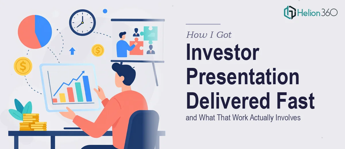
A proper investor presentation isn't just designed — it's structured. The narrative arc has to answer investor questions in the right sequence: problem, solution, market size, traction, team, and financials. Each section has to earn the next. Disrupt that sequence and the logic collapses.
Then there's the data. Investors expect financial projections, market sizing, and growth metrics to be visualized clearly — not pasted in from a spreadsheet. The visual treatment of numbers communicates confidence. A bar chart with inconsistent scaling or a table with no visual hierarchy signals that the founders haven't thought through how they're being perceived.
And then there's the design layer itself — typography, color discipline, layout consistency — which takes real craft to execute at a level that reads as credible to a sophisticated audience. I realized quickly that attempting this myself in the time available wasn't realistic.
What the Build Actually Looks Like When Done Well
The structural work starts with auditing the raw content — every claim, every number, every positioning statement — and mapping it to a narrative spine. For an investor pitch deck, that spine typically follows a 10-to-14 slide arc: one slide per major investor question, with a logical through-line that builds tension and resolves it in the financials and ask. The practitioner's job here is to compress complex business logic into the minimum number of words that retain full meaning. That's a different skill from writing a business plan — it's editorial compression under design constraints, and it routinely takes multiple passes to get right.
Visual mechanics are where a lot of decks fall apart. Done properly, an financial presentation runs on a consistent 12-column layout grid, with a type hierarchy anchored around something like 36pt for section headers, 24pt for body callouts, and 16pt for supporting detail. Charts follow a strict rule: one insight per chart, labeled directly rather than relying on a legend. Waterfall charts for cash flow, clustered bars for market comparison, simple line charts for growth trajectory. Each chart type is chosen for the specific cognitive task the investor needs to complete. Getting these decisions right requires not just design knowledge but an understanding of how investors read financial data.
Polish and brand consistency across the full deck is the last layer, and it's the one that's easiest to underestimate. A palette limited to 3-4 brand colors applied with discipline, icon sets that come from a single visual family, and slide masters that hold every layout variation without breaking — these are the details that make a deck feel like a unified argument rather than a collection of slides. Each inconsistency, however small, introduces a moment of cognitive friction for the reader. In a pitch, those moments accumulate. Maintaining this consistency across 12 or more slides, through multiple content revisions, is where the real time gets spent.
Why I Brought in Helion360 to Handle the Full Project
I didn't attempt to build this myself and then hand it off for polish. I recognized immediately that the full scope — narrative restructuring, data visualization, and design execution — was more than I could pull off at the standard this moment required.
Helion360 handled the project end-to-end. That meant taking the raw content and financial data, restructuring the narrative into a clean investor-ready arc, translating the numbers into properly designed charts and visual callouts, and applying consistent brand treatment across every slide. The deck came back looking like it had been built by a team that does this work every day — because it had been.
What stood out was the speed. The turnaround was done in days, not the weeks it would have taken me to learn and execute this properly myself. The team had the tooling, the design system knowledge, and the investor-deck conventions already in place. There was no learning curve on my end, and no back-and-forth trying to explain what "professional" looks like — they already knew.
What the Deck Delivered and What I'd Tell Anyone in the Same Spot
The final presentation was tight, credible, and visually clean in a way that matched the seriousness of the conversation we were entering. The narrative held together from the first slide to the ask. The financials were readable at a glance. The brand felt consistent and intentional. The feedback in the room was exactly what I needed — the questions were about the business, not the materials.
If you're looking at a similar situation — a high-stakes investor meeting, a deck that isn't ready, and not enough time to close that gap yourself — Helion360 is the team I'd engage. They handled the full execution fast, and delivered at exactly the level this kind of presentation demands.