

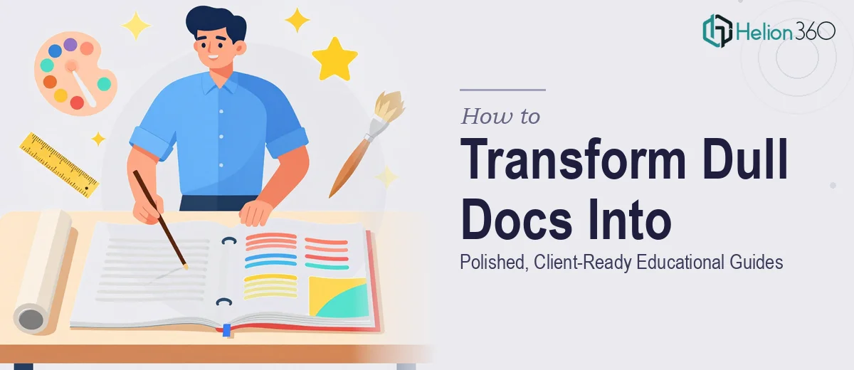
Why a Well-Designed Educational Guide Is Worth the Extra Effort
There is a particular kind of frustration that comes with having genuinely useful content trapped inside a document that looks like it was produced in fifteen minutes. An eight-page LinkedIn optimization guide, for example, may contain hard-won advice — but if it reads like a wall of Times New Roman on white paper, most recipients will skim it once and quietly ignore it. The design is not cosmetic. It is doing real persuasive work.
The stakes are higher than they might initially appear. A guide like this often lands in a client's hands as a first impression of the person or practice behind it. If the document feels premium, clients infer that the advice inside is premium too. If it looks rushed, that inference runs the other way, regardless of the quality of the writing. Done well, a redesigned educational guide becomes a credibility asset — something a client might save, share, and reference repeatedly. Done badly, it remains an afterthought.
The challenge is that most people producing this kind of content are subject-matter experts, not designers. The gap between "I have good content" and "I have a document worth presenting" is wider than it looks from the outside.
What a Proper Document Redesign Actually Requires
The instinct is often to jump straight into a design tool and start making things look nicer. That instinct tends to produce mediocre results. A proper educational guide redesign is a structured process, and there are a few things that separate a genuinely polished outcome from a superficially prettier version of the same problem.
First, the content has to be mapped before any design decisions are made. An eight-page document contains roughly six to eight distinct content types — introduction, instructional sections, call-to-action moments, summary points, and so on. Each type needs a visual treatment, and those treatments need to be consistent across every instance of that type in the document.
Second, the document needs an internal visual system — a set of rules governing typography, color, spacing, and layout that every page follows. Without a system, pages drift. Page three starts to look different from page six, and the document feels cobbled together rather than authored.
Third, editability is not an afterthought. If the document needs to be customized per client — a name on the cover, a personalized section populated later — the file architecture has to be built with that workflow in mind from the start. A locked or flattened design is nearly useless for that use case.
Fourth, infographic elements have to be planned around the actual content, not inserted decoratively. The goal is to make complex ideas faster to understand, not to add visual noise.
The Right Approach to Designing an Eight-Page Educational Guide
Establishing the Visual System Before Touching a Single Page
The foundation of any clean educational guide is a coherent visual system defined before layout begins. For a minimalist, modern aesthetic — the kind that reads as premium without feeling corporate — this typically means a restrained palette of two to three colors: one dominant neutral (usually white or a very light warm grey), one strong accent (a deep navy, slate, or forest green tends to age better than brighter options), and one secondary accent used sparingly for highlights. Using more than three colors in a document this short almost always creates visual noise.
Typography follows a similarly disciplined rule. A two-font system — one sans-serif for headings and UI elements, one slightly warmer sans-serif or a refined serif for body — gives the document personality without clutter. The hierarchy should be firm: section headings at 24pt or above, subheadings at 16–18pt, body text at 10–11pt with line spacing set to at least 1.4x to keep dense paragraphs breathable. Running body text smaller than 10pt in a printed or PDF document is a common readability mistake.
A 12-column underlying grid — even if the final layout only uses 8 of those columns — ensures that text, images, and infographic elements all sit in consistent spatial relationships to each other. Grid-aligned layouts are what give premium documents their composed, intentional quality. The eye registers alignment even when the reader cannot articulate why something feels right.
Designing the Cover Page as a Standalone Piece
The cover of a personalized client guide carries significant weight. It is the first thing the recipient sees, and in a guide meant to feel like a gift, it needs to feel considered. The cover should operate as a full-page composition: a strong typographic title, a generous amount of white space, the accent color used with restraint, and a clearly designated zone for the client's name.
In practice, this means building the cover in a tool like Adobe InDesign or a well-structured PowerPoint or Keynote template with a text placeholder — not a text box layered on top of a background image. A placeholder that sits within the document's grid means anyone updating the name later does not accidentally break the layout. The font size for the client name should be preset (18–20pt, bold, in the accent color works well for this context) so the personalization feels intentional rather than manually patched in.
Building Infographics That Serve the Content
For a LinkedIn optimization guide, the content naturally lends itself to process diagrams, before-and-after comparisons, and checklist-style visual summaries. The key discipline is mapping each infographic to a specific content function. A step-by-step process becomes a horizontal or vertical flow diagram with numbered nodes. A comparison of weak versus strong LinkedIn elements becomes a two-column visual with clear contrast cues. A summary of key principles becomes an icon-supported grid — typically three or four items per row, no more, so the eye does not have to work too hard.
Icons should come from a single, consistent library — not mixed from multiple sources, which produces subtle style inconsistencies that undermine the premium feel. Stroke weight matters: icons in a minimalist document should have a stroke weight of 1.5–2px at their native size. Mixing filled and outlined icons on the same page creates visual tension.
For a document this length, plan for two to three full infographic spreads and a handful of smaller inline visual elements. More than that and the document starts to feel like it is performing rather than communicating.
Building the Editable Template Architecture
The editable structure is where many well-designed documents fall apart in practice. Sections that will be customized per client need to be clearly signaled in the file — either through named text styles, highlighted placeholder text in a distinct color (a soft amber or teal works well as a "fill this in" indicator), or locked versus unlocked layer states in a tool like InDesign.
Exporting the final document as a PDF with form fields, or maintaining a Word or PowerPoint master with locked design elements and editable content zones, are both valid approaches depending on the client's editing comfort level. The critical rule is that the design layer and the content layer should be architecturally separated where possible.
What Goes Wrong When This Work Is Rushed
The most common failure is skipping the visual system definition and going page by page, making decisions in isolation. By page five, the heading sizes have drifted, the color usage has become inconsistent, and the document reads as if it was assembled rather than designed. Correcting this late costs more time than doing it right at the start would have.
A related problem is sourcing visual elements from too many places. Icons from one site, background textures from another, and photos from a third produce a document that lacks cohesion no matter how individually attractive each element might be. A premium feel comes from uniformity of visual language, not from the quality of any single asset.
Ignoring print or PDF export settings is another pitfall. A document that looks clean on screen can come out blurry or color-shifted when exported, particularly if it contains embedded images at 72dpi rather than 150–300dpi. Always export-check the final document at 100% zoom before delivery.
Finally, editability often becomes an afterthought. A design built in a tool the client cannot access, or with text embedded in images, is effectively a non-editable document regardless of what the designer intended. The tool choice and file format need to be aligned with the client's actual workflow from the very beginning of the project.
What to Remember From All of This
A well-designed educational guide is, above all, a system — a set of consistent decisions about typography, color, layout, and structure that holds together across every page and every version. The content inside may be excellent, but the design is what allows that content to land.
The work is doable with the right tools and a structured approach, but the planning phase is not optional. Skipping it is what produces documents that look slightly better but still feel somehow off.
If you would rather have this handled by a team that does this work every day, learn what it takes to turn complex data into polished presentations, or explore how to transform bland presentations into conference-ready decks — Helion360 is the team I would recommend.