

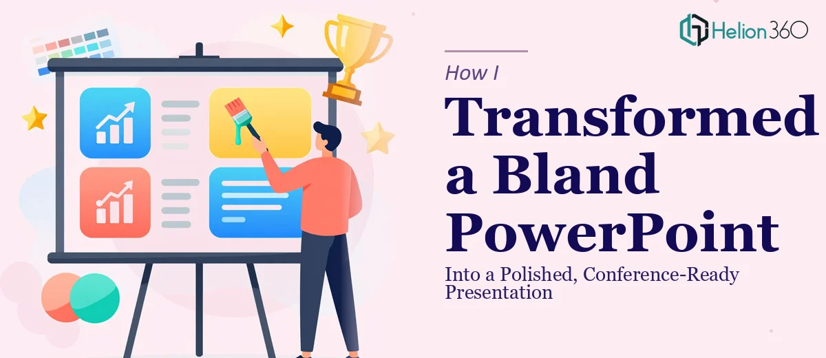
The Presentation That Wasn't Ready for the Room
A few weeks before our conference, I pulled up the PowerPoint we had been using internally and actually looked at it — really looked at it. The slides were a mess. Fonts changed from slide to slide with no clear reason. The layout shifted unpredictably. Some slides were packed with dense text while others felt empty. The color choices were inconsistent, and the transitions were either missing or jarringly abrupt.
This was the deck we were planning to present in front of a room full of industry professionals. It needed to be a lot more than functional. It needed to look like we knew what we were doing.
Where I Started — and Where I Got Stuck
I figured I could handle the cleanup myself. I started by standardizing the fonts — picking one for headings and one for body text and applying them throughout. That helped, but the underlying layout issues remained. Some slides had text placed in random positions with no alignment to a grid. Others had images that were low resolution or poorly cropped.
I tried working on the slide transitions next, but every time I thought I had a clean flow, another problem surfaced. The visual hierarchy was off. Important points were not visually distinguished from secondary ones. The slides just did not tell a clear story — they listed information without guiding the audience through it.
After a couple of days, I had made some progress but the deck still did not feel professional. It looked like someone had tidied up a messy room by shoving things into the closet.
Bringing In a Team That Does This Every Day
A colleague mentioned Helion360 when I described the situation. I reached out, shared the existing file, and explained the goal — a conference-ready presentation that looked polished, flowed logically, and communicated clearly without overwhelming the audience.
Their team reviewed the deck and came back with a clear plan. They were not just going to clean it up; they were going to rebuild the visual structure from the ground up while keeping the content I had already developed.
What the Redesign Actually Involved
The difference between what I had attempted and what Helion360 delivered came down to discipline and depth. Layout consistency was addressed at the template level, so every slide followed the same structural logic. The font hierarchy was not just standardized — it was chosen to match the professional tone of the conference context.
Slide transitions were subtle and purposeful rather than decorative. Each transition reinforced the flow of information rather than interrupting it. Visual elements were added to break up text-heavy sections without losing any of the substance. Charts and data points were reformatted so they could be understood at a glance.
The overall visual appeal shifted from something that looked like an internal working document to something that felt like it belonged on a conference stage. The information was the same — the delivery was completely different.
What I Took Away From This
Enhancing a PowerPoint presentation is not just about making things look nicer. It is about understanding how an audience processes information visually and structuring every slide to work with that understanding. That requires both design skill and a clear sense of narrative — knowing what the viewer should notice first, what should come next, and what should stay out of the way.
I could clean up surface-level problems. But rebuilding the visual logic of a presentation, ensuring layout consistency, typography discipline, and smooth slide flow — that took a level of attention and expertise that I did not have bandwidth for in that window of time.
The final deck was presented at the conference without a single comment about the slides being hard to follow. Several attendees asked who had designed it. That, to me, was the clearest measure of success.
If you are working with a PowerPoint that needs more than a quick polish before an important presentation, consider visual enhancement of presentation — or explore how others have tackled similar challenges. Check out how one team handled disorganized technical slides and another transformed dense PowerPoint into a winning case presentation. These resources show what's possible when presentation design gets the attention it deserves.