

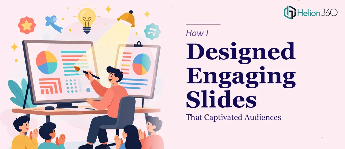
When Your Slides Look Nothing Like the Idea in Your Head
I had a presentation coming up that mattered. Not just internally — this one was going to be seen by people outside the organization, and it needed to hold attention from the first slide to the last. The content was solid. The problem was everything else.
My slides looked like a working draft. Inconsistent fonts, text-heavy layouts, stock visuals that felt disconnected, and a color palette that had no real logic to it. I knew what I wanted the deck to feel like, but I could not get the design to reflect it.
What I Tried Before Asking for Help
I started by browsing PowerPoint templates, hoping something would match the tone of the presentation. Nothing fit well enough to use as-is, and customizing templates to match my brand took longer than building from scratch. I then tried adjusting spacing, swapping colors, and cleaning up individual slides one at a time.
A few hours in, the deck looked slightly better but still inconsistent. The individual fixes were not adding up to a cohesive visual story. Slide three looked completely different from slide nine, and the hierarchy of information was still unclear. The slides were not engaging — they were just slightly less cluttered.
I also realized I was spending time I did not have. The deadline was close, and the deeper I went into the design, the more I could see how much work it actually needed.
Bringing in a Team That Knew What It Was Doing
That's when I reached out to Helion360. I explained the situation — I had a deck that needed a full visual overhaul, not just a few tweaks. I shared the existing file and gave them a brief on the presentation's purpose, audience, and tone.
Their team came back with questions I had not thought to answer myself: What emotion should the audience feel at the end? Was the presentation meant to inform, persuade, or inspire action? How much flexibility did I have on the color scheme? Those questions alone told me they were approaching it differently than I had been.
What the Redesign Actually Involved
Helion360 worked through the entire deck systematically. They established a consistent visual language across all slides — a defined typography scale, a color system that reflected the brand, and a layout grid that gave every slide a clear structure. Text-heavy slides were broken into visual sections. Data was turned into clean, readable charts. Section dividers were added to help the audience track where they were in the presentation.
The icons and imagery were replaced with visuals that actually supported the content rather than just filling space. Slide transitions were subtle and intentional. By the time I reviewed the revised deck, it felt like the same presentation had been rebuilt with a completely different level of craft.
What stood out most was how the story became easier to follow. The visual hierarchy guided the eye through each slide in the right order. Nothing felt crowded or arbitrary. Every design choice served a purpose.
What I Took Away From the Experience
Presentation design is not just about making things look nice — it is about making information land. Visually engaging slides reduce cognitive load for the audience. They guide attention, build trust, and make the presenter look prepared. I understood that intellectually before, but seeing it applied to my own deck made it concrete.
I also learned that design consistency matters more than individual slide polish. One well-designed slide in a poorly structured deck does not save the deck. The whole thing has to hold together.
The final presentation went well. The feedback I got was not just about the content — people commented on how clear and professional it looked. That does not happen with a rough draft.
If your slides are technically complete but visually falling flat, Helion360 is worth reaching out to. They took my disorganized deck and turned it into something that actually worked — and did it faster than I could have done it on my own.
Related Resources:
- High-impact PowerPoint presentations can transform how audiences receive technical information.
- Learn about professional presentation templates that maintain consistency across your entire deck.