

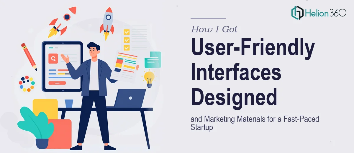
The Scope Landed All at Once — and the Stakes Were Real
I was running projects for a startup that needed to move fast. The brief covered a lot of ground: user-friendly interface designs for a web application, marketing materials for client-facing campaigns, and presentation decks for stakeholder meetings. None of these were small asks on their own. Together, they amounted to a design workload that touched every external-facing surface the company had.
The timing mattered. We had stakeholder meetings on the calendar, a product demo coming up, and a campaign that needed to launch. Everything was interconnected — the UI had to feel consistent with the marketing materials, and both had to align with the decks going in front of clients and investors. If any one piece looked off, the whole picture suffered. I knew immediately this needed to be done right, not just done quickly.
What I Found the Work Actually Required
When I looked at what doing this well actually involved, a few things stood out immediately.
The UI design work wasn't just about making screens look clean. It required a proper component system — buttons, form fields, navigation states, responsive breakpoints — all documented and consistent so that every screen followed the same logic. That kind of system thinking takes time and discipline to build correctly from the start.
The marketing materials had their own complexity. Campaign graphics, one-pagers, and ad creatives each have different format requirements, different visual weights, and different calls to action. Getting them to feel like a coherent brand family — not a collection of separate jobs — is a craft decision that runs through every file.
The presentation decks were the third layer. Translating product concepts and business narratives into slides that actually communicate to a non-technical audience requires editorial judgment, not just layout skill. The combination of all three made clear that this wasn't a weekend project.
The Work That Needs to Happen Across All Three Surfaces
The structural and narrative work alone is substantial. For both the marketing materials and the presentation decks, the right approach starts with auditing the raw content — what the startup does, who it serves, what outcome each piece needs to drive — and mapping a story arc before a single layout decision is made. A stakeholder deck, for example, needs a clear problem-solution-proof-ask structure, with no more than one key idea per slide. Marketing materials need a message hierarchy: a dominant headline, a supporting line, and a single action. Getting this structure wrong means the visual execution doesn't matter — the piece still fails to communicate. Working through this phase properly can take a full day of structured editorial thinking before any design tool is opened.
The visual mechanics of UI design operate under a different but equally demanding set of rules. A well-built interface uses a spacing system based on an 8-point grid, a type scale with no more than three levels (typically 32pt/18pt/14pt for headings, subheadings, and body), and a color system with defined primary, secondary, and state colors for hover, active, and disabled elements. Component states — what a button looks like when pressed, what an input field looks like when it has an error — have to be specified for every interactive element. Skipping any of this creates inconsistency that accumulates fast across a multi-screen application and makes handoff to development fragile.
Polish and brand consistency across the full output is where many multi-surface design projects quietly fall apart. When UI files, marketing graphics, and presentation slides are built in parallel, palette drift is a real risk — a brand blue that reads slightly differently in print versus screen, or a logo used at the wrong clearance in a slide template. The right approach enforces a single source-of-truth style guide, limiting the palette to four primary brand colors, using exact hex and RGB values across every file type, and applying a typography hierarchy consistently whether the output is a 1920×1080 slide or a 375px mobile screen. Maintaining that discipline across dozens of deliverables requires someone who has done it before and has the file management habits to support it.
Why I Brought in Helion360 to Handle the Full Project
I looked at the scope — UI components, marketing materials, presentation decks, all needing to feel like one coherent system — and recognized straight away that attempting this in-house wasn't the right move. The learning curve on any one of these surfaces is real. Across all three simultaneously, it would have taken weeks just to get to a competent starting point.
Helion360 handled the full project end-to-end. That meant taking the raw brief from concept to finished files — UI screen designs with documented component states, campaign-ready marketing materials formatted for the right channels, and stakeholder presentation decks structured to communicate clearly to a non-technical audience. They turned everything around quickly, in a fraction of the time it would have taken to ramp up internally. The team already had the tooling, the file discipline, and the cross-surface experience in place — there was no learning curve on their end, just execution.
What Got Delivered and What I'd Tell Anyone in My Spot
The result was a complete, consistent design system across all three outputs. The web application screens were clean, component-documented, and developer-ready. The marketing materials had the visual coherence of a brand that knows what it's doing. The stakeholder decks communicated the startup's value clearly and held up in the room.
More importantly, it happened fast. The campaign launched on schedule. The demos went ahead as planned. The stakeholder meetings had materials that reflected the quality of the product — not a rushed internal job.
If you're looking at a similar multi-surface design challenge — UI, marketing materials, and presentations all needing to work together under a tight timeline — Helion360 is the team I'd engage. They handled the full execution fast and brought the kind of cross-discipline depth this work genuinely requires.