

I had a conference coming up in less than a week. My goal was straightforward — walk into that room, present my expertise in Vastu Shastra-based architectural design, and leave with serious client conversations started. What I underestimated was how hard it is to translate something as layered and nuanced as Vastu Shastra into a clean, visually engaging PowerPoint presentation that non-specialists could immediately understand and trust.
The Challenge With Explaining Vastu Shastra Visually
Vastu Shastra is not a simple concept to present. It sits at the intersection of ancient Indian architectural science, spatial energy flow, directional alignment, and modern building design. When I sat down to build the slides myself, I kept running into the same problem — the content was rich, but the slides looked either too text-heavy or too vague. Diagrams I pulled together looked inconsistent. The flow from one concept to the next felt disconnected.
I knew the subject deeply. That was not the issue. The issue was translating that depth into a presentation format that could hold an audience's attention for 20 minutes and move them toward wanting to work with me. Architecture presentations need to be both informative and visually persuasive, and that balance is harder to strike than it looks.
I tried reworking the slide order, simplifying the language, and experimenting with different layouts. Each version felt like a step sideways rather than forward. With the deadline approaching, I needed to make a decision.
Bringing in the Right Support
After hitting a wall with my own attempts, I came across Helion360. I explained the context — a Vastu Shastra architecture presentation aimed at potential high-value clients, with a conference deadline roughly five days out. Their team asked the right questions from the start: What is the core message? Who is the audience? What action should someone take after seeing this?
Those questions alone helped me clarify what the presentation actually needed to do. From there, Helion360 took over the design work entirely. I shared my content, rough slide notes, and some reference images, and they handled the rest.
What the Final Presentation Looked Like
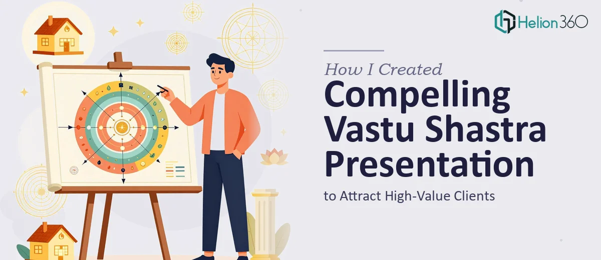
The finished slides were a significant step up from anything I had put together. The architecture presentation opened with a strong visual narrative — showing the contrast between spaces designed with Vastu principles and those without. Each section moved logically from concept to application, with clean diagrams that explained directional orientation, room placement, and energy flow in ways that felt accessible without oversimplifying.
The typography and color palette were calm and professional, which suited the subject matter well. Vastu Shastra deserves a presentation that feels considered and grounded, not flashy, and the design reflected that. Key concepts were highlighted with custom infographic-style visuals rather than dense paragraphs, which made the material much easier to absorb during a live presentation.
The slide layout also gave me natural pauses to speak — a detail that matters enormously when you are presenting in person. Good business presentation design is not just about aesthetics. It is about supporting the speaker, not competing with them.
What I Took Away From This Experience
The conference went well. Several attendees approached me afterward specifically mentioning the presentation — how clear it was, how well it explained something they had heard about but never fully understood. A few of those conversations turned into follow-up meetings.
What I learned is that subject matter expertise and presentation design are genuinely different skills. I could explain Vastu Shastra in a room full of professionals without a single slide. But turning that knowledge into a structured, visually coherent presentation that works in a conference setting requires a different kind of thinking — one that balances design, storytelling, and audience psychology.
I also learned not to wait until the last two days to ask for help. The turnaround was fast, but delivering under a tight deadline would have benefited from more preparation time.
If you are an architect, consultant, or specialist trying to put together a presentation that does justice to complex work, Helion360 is worth reaching out to — they stepped in at a difficult moment, understood the brief quickly, and delivered a presentation I was genuinely proud to walk into that conference with.