

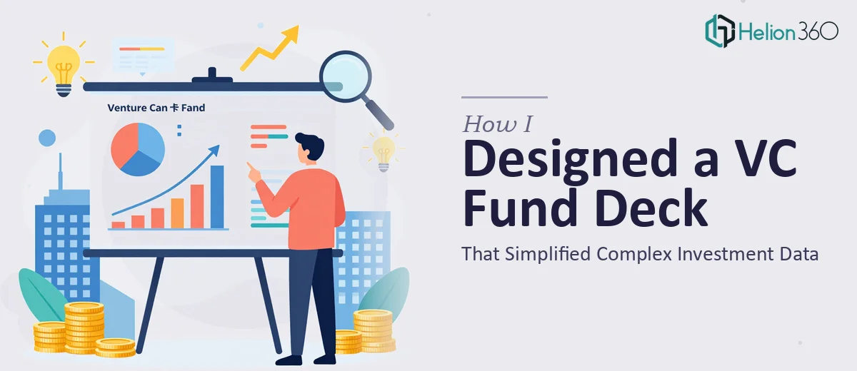
The Brief Sounded Simple. The Work Was Anything But.
When our venture capital fund launched, we needed one thing above everything else: a polished, professional fund overview deck that could communicate what we do, how we invest, and why our approach is different. Simple enough on paper. In practice, it turned into one of the more complex design challenges I had faced in a while.
The content itself was dense. We had investment theses, portfolio construction logic, sector focus areas, growth projections, return expectations, and fund structure details — all of which needed to appear in a single presentation without overwhelming the reader. This was not a startup pitch deck where you lead with a problem and a hook. A VC fund overview deck needs to project credibility, precision, and vision all at once.
Where My Own Attempt Fell Short
I started building the deck myself. I had a clear outline, and the raw content was ready. But when I began translating it into slides, the gaps became obvious fast.
The financial data — projections, allocation breakdowns, return scenarios — resisted every layout I tried. Tables looked flat. Charts felt disconnected from the narrative. Slides that made sense to me as the author came across as cluttered when I showed them to a colleague unfamiliar with the fund. The design was functional, but it did not feel like something you would confidently show to a limited partner or institutional investor.
Investor-facing presentations carry a certain standard. The layout has to guide the reader through complex information without requiring explanation. The visual hierarchy has to do the heavy lifting. I knew what I wanted the deck to say — I just could not make it look the part.
Bringing in the Right Team
After a few rounds of edits that were not moving things in the right direction, I reached out to Helion360. I shared the content, walked them through the structure, and explained the audience — sophisticated investors who would scrutinize every detail. Their team asked the right questions upfront: tone preferences, brand colors, the level of visual complexity we wanted for the data slides, and how much white space we were comfortable with in a deck this dense.
That conversation alone told me they understood the difference between a generic investor presentation and a VC fund overview deck built for a specific context.
What the Final Deck Looked Like
The Helion360 team restructured the flow in a way that felt immediately more natural. The fund thesis came through clearly in the first few slides before any numbers appeared. The investment strategy section used a combination of structured layouts and custom iconography to make the logic scannable without being simplistic.
The data visualization work on the financial slides was where the biggest improvement happened. Growth projections that had looked like spreadsheet exports were rebuilt as clean, branded charts with clear callouts. The portfolio construction framework, which I had been struggling to present visually, became a diagram that communicated the logic in a single glance.
The entire deck held together visually — consistent type hierarchy, a restrained color palette that felt institutional, and slide transitions that did not distract. It looked exactly like something a newly launched fund should be presenting.
What This Project Taught Me
A venture capital fund overview deck is a specific document with specific demands. It is not just about good design — it is about presenting complex investment data in a way that builds trust with a sophisticated audience. Getting that balance right requires both design skill and an understanding of how financial information should flow.
I also learned that knowing your content deeply does not automatically translate into knowing how to present it. The clearest thinking still needs a clear visual container, and building that container for a VC fund overview is a craft in itself.
If you are working on a similar fund deck and finding that the design is not matching the quality of your underlying content, Helion360 is worth reaching out to — they handled the complexity I could not crack and delivered a deck that held up in the rooms that mattered.