

The Brief Sounded Simple Enough
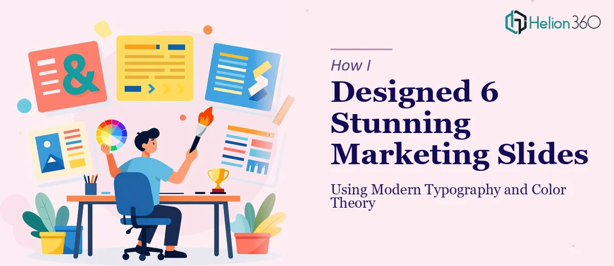
Six slides. That was all I needed to produce for an upcoming marketing campaign. The ask was clean on paper — modern design, engaging layout, charts, graphs, and images all working together in a way that would actually hold an audience's attention.
I figured I could handle it myself. I knew the campaign inside out, I understood the message we were trying to communicate, and I had PowerPoint open and ready. How hard could six slides really be?
Where the Design Complexity Crept In
The first couple of slides came together reasonably well. A bold headline here, a clean background there. But the moment I started layering in charts alongside images and trying to make everything feel cohesive, I ran into the kind of design friction that is hard to explain unless you have lived it.
Color theory was the first thing that exposed the gap in my skills. I knew roughly which brand colors to use, but getting the right tonal balance — so that the data visualizations did not visually compete with the imagery — required a level of intentionality I was not equipped for. I tried a few combinations that looked acceptable on screen but felt off when I previewed them at full size.
Then came typography. Pairing a display font for headings with a legible body typeface, while also maintaining visual hierarchy across six very different slide layouts, was genuinely demanding. I kept adjusting font sizes, weights, and spacing, and every fix seemed to create a new problem somewhere else on the slide.
The charts were the final obstacle. The data was not complicated, but presenting it in a way that was both accurate and visually engaging — where the chart style matched the overall presentation aesthetic rather than clashing with it — was something I could not quite nail on my own.
Bringing in the Right Expertise
After spending more time than I had budgeted on revisions that were not improving the work, I reached out to Helion360. I shared the campaign brief, the content for all six slides, rough notes on what each slide needed to communicate, and a general direction for the visual style.
Their team got to work quickly. What came back was a set of slides that immediately looked like the kind of professional presentation design I had been trying to produce but could not quite execute. The typography was handled with real precision — clear hierarchy, readable at every size, and consistent across every layout. The color palette was deliberate in a way mine had not been, using contrast and saturation to guide the viewer's eye without overwhelming the content.
What the Final Slides Actually Looked Like
The charts were integrated into the slides rather than just dropped in. Each data visual felt like it belonged to the same design system as the rest of the content. Images were placed and scaled thoughtfully, and the overall rhythm of the deck — how one slide led into the next — felt intentional rather than accidental.
The alignment was exact. Everything from text blocks to icons to chart labels sat on a consistent grid, which made the whole deck feel polished in a way that is difficult to fake and easy to notice.
Seeing the finished version made it clear how much of good presentation design comes down to decisions that look invisible when done right — the kind of micro-choices around spacing, weight, and color that experienced designers make without overthinking them.
What I Took Away From the Process
Designing six marketing slides is not inherently difficult. But designing six slides that are clean, modern, visually consistent, and capable of holding attention during a campaign presentation is a different task entirely. The gap between a functional slide and a well-designed one is mostly filled by applied knowledge of color theory, typography, and layout — and that knowledge takes time to develop.
I came away with a much better understanding of what professional presentation design actually involves, and a clearer sense of when it makes sense to work through the problem alone versus when bringing in someone with the right skills gets a better result faster.
If you are working on a marketing presentation and finding that the design is not landing the way the content deserves, Helion360 is worth contacting — they handled exactly the kind of nuanced visual work that was holding my project back.