

The Problem With Launching Without the Right Visuals
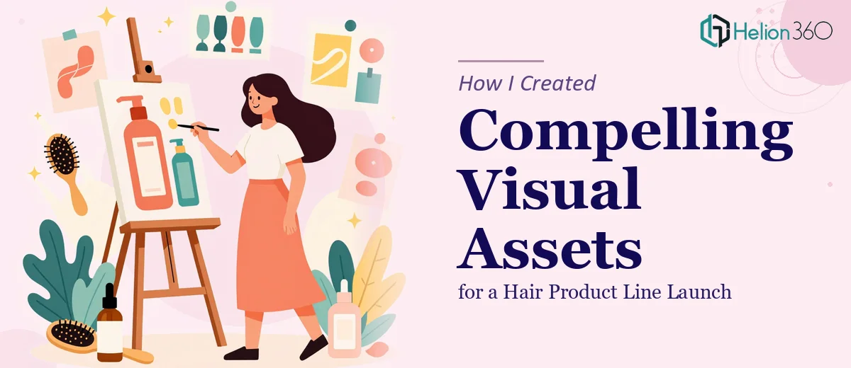
When I decided to launch a new hair product line, I quickly realized the product itself was only half the story. The other half — the part that would determine whether buyers, distributors, and retail partners actually took us seriously — was how we presented it. We needed a cohesive set of visual assets: a product introduction deck, supporting marketing slides, and clean one-pagers that could travel across channels and audiences.
The stakes were real. We had a defined window to approach early retail partners, and the first impression had to carry weight. A rough deck or an inconsistent set of materials would signal a brand that wasn't ready. A polished, well-structured presentation would signal the opposite. I knew immediately this wasn't something to patch together in a few evenings — it needed to be done properly, by people who do this work at a high level every day.
What I Found This Kind of Work Actually Requires
Once I started mapping out what a proper product launch presentation actually involves, the scope became clear fast. This isn't just about making slides look attractive. Done well, it requires building a visual narrative that guides the audience from problem to product to proof — and doing that across multiple asset types that feel like they belong to the same brand world.
Three things stood out as genuinely complex. First, the structural work: deciding what each asset needs to say, in what order, and how each piece connects to the others. Second, the visual mechanics: establishing a design system — type scale, color palette, grid, iconography — and applying it with precision across every slide and page. Third, brand consistency: making sure every asset, from a 20-slide deck to a single one-pager, reads as the same brand at the same quality level. Any gap in execution across those three areas shows immediately to a trained eye.
The Work That Needs to Happen
The structural layer of this kind of project starts with auditing the source material and mapping a clear story arc before a single slide gets built. For a product launch, that means establishing the problem the product solves, the product's differentiators, the target consumer, and the go-to-market rationale — each given its own section with a defined purpose. The friction here is that most founders have all of this information but not in a form that translates directly into a presentation flow. Reorganizing it into a logical, audience-facing narrative takes real editorial judgment and usually several rounds of structural review before the visual work even begins.
The visual mechanics layer is where a lot of self-built decks fall apart. Proper presentation design for a product launch uses a defined type hierarchy — typically a 36pt headline, 24pt subhead, and 16pt body — applied consistently across every layout. Color usage follows strict palette discipline: a primary brand color, one or two secondaries, and a neutral set for backgrounds and text, with no ad-hoc additions. Grids matter too: a 12-column base grid keeps spacing consistent and prevents the misaligned margins and uneven padding that make amateur decks feel unfinished. Setting all of this up correctly in a master slide system takes significant time for anyone not working in this tooling daily.
Polish and consistency across the full asset set is the final layer, and it's where the effort multiplies. When the deliverable includes a product deck, a one-pager, and supporting marketing slides, every element — iconography style, photo treatment, chart formatting, header spacing — must read as unified. A mixed-style icon set or inconsistent photo crop ratio breaks the brand cohesion immediately. Achieving real consistency across a multi-asset set means building with shared components and reviewing each asset against the others at every stage, which is a slow and methodical process that requires both design skill and disciplined quality control.
Why I Brought in Helion360 to Handle It
Once I understood what this work actually involved, the decision to engage Helion360 was straightforward. This wasn't a project where learning as I went was a realistic option — the timeline didn't allow it, and the audience we were presenting to would notice the difference between thoughtful execution and something put together under pressure.
Helion360 handled the full project end-to-end. That meant the structural narrative work — organizing the product story into a clean, logical flow across each asset — the visual system setup, and the full build and polish of the complete asset set. They turned it around quickly, in a fraction of the time it would have taken me to work through even the design system setup alone. What I brought to the table was the product knowledge and the business context. What they brought was the execution depth, the tooling, and the experience of having done this kind of work across a wide range of product categories.
The Outcome and What I'd Tell Anyone in My Spot
What came back was a complete, polished set of launch assets that looked like they belonged to a real brand with real backing. The product deck held together as a narrative — it moved from market context to product differentiation to retail opportunity in a way that felt natural rather than forced. The one-pagers were clean and usable without additional cleanup. Everything read as consistent across the set.
The retail conversations we took those materials into went better than they would have with anything we could have pulled together ourselves in the same window. The materials did part of the work before anyone said a word.
If you're looking at a product launch and realize the visual assets need to carry real weight with a serious audience, Helion360 is the team to engage — they handled the full execution fast and brought the kind of design and structural depth this work genuinely requires.