

The Problem That Made It Clear This Needed to Be Done Right
I was working with a growing art startup at a pivotal stage — they were moving from a scrappy early presence into a position where they needed to be taken seriously by galleries, retail partners, and a broader online audience. The brand existed in fragments: a logo that had been designed in a hurry, a color palette that had drifted across print and digital applications, and no coherent system tying any of it together.
The stakes were real. They had a set of partnership meetings coming up, new product lines going to print, and a website refresh already in motion. Everything needed to look like it came from the same place — the same brand, the same visual language, the same level of intentionality. Doing this halfway would have meant mixed signals to exactly the audience they were trying to win over. I recognized immediately that this required a properly built visual identity system, not a round of quick fixes.
What I Found a Visual Identity System Actually Requires
Once I started understanding what a real multi-platform visual identity system involves, the scope became very clear very fast.
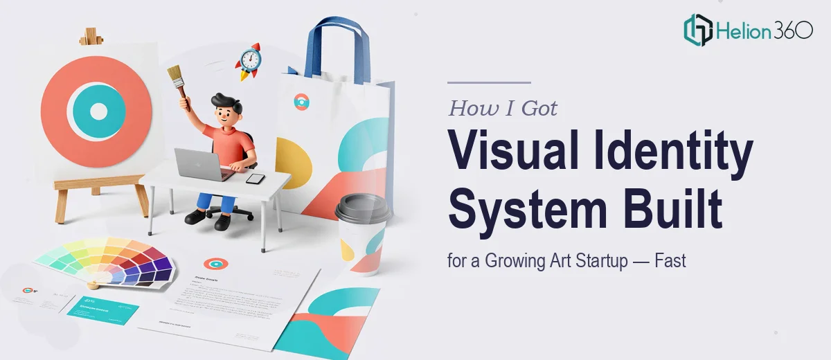
First, a visual identity system is not just a logo and a color swatch. Done properly, it's a documented design language — one that governs how the brand behaves across business cards, social templates, pitch decks, packaging, and digital environments. That means primary and secondary palettes with precise hex and CMYK values, a defined typographic hierarchy with specific weight and size rules, and grid-based layout logic that works at multiple aspect ratios.
Second, an art startup adds a layer of complexity most brand projects don't have. The visual system has to carry aesthetic authority — it needs to look like it belongs alongside the work it represents, not like a generic corporate template. That requires taste and restraint in equal measure, which isn't something you can template your way into.
Third, multi-platform means testing every element against real-world surfaces: small-format print, large-format display, mobile screens, and presentation slides. What works beautifully in one context can break completely in another. That kind of cross-platform audit takes structured iteration, not a single pass.
What Doing This Work Well Actually Involves
The structural foundation of a visual identity system starts with a full audit of every existing brand asset and a clear decision about what carries forward versus what gets rebuilt. The right approach involves establishing a primary palette of no more than four colors with precise hex, RGB, and CMYK values documented for each, alongside a typographic hierarchy — typically a three-level scale (display, body, caption) with specific point sizes and weight rules at each level. Getting those foundational decisions right before anything goes to layout is what prevents the drift that plagues most early-stage brand systems. The friction here is that this audit phase is slower than it looks. Categorizing assets, reconciling inconsistencies, and making deliberate keep-or-cut decisions takes a trained eye and disciplined restraint that most non-designers underestimate.
Visual mechanics across multiple platforms require building layout logic that holds at different aspect ratios — a 16:9 presentation template, a 1:1 social tile, an A4 print sheet, and a business card are four completely different spatial problems governed by the same brand. The standard approach uses a 12-column grid as a base, with column and gutter widths that scale proportionally across formats. Type size minimums for legibility differ by medium: what reads cleanly at 10pt in print becomes unreadable on a mobile screen. Applying a consistent grid across that many surface types without it looking rigid or mechanical is genuinely difficult work, and it's where most DIY brand attempts fall apart.
Polish and consistency across the full deliverable set is where the effort compounds. Every template — presentation master, social format, print layout — needs to be checked against the brand rules at the element level: icon weights match the typeface stroke width, spacing follows the same baseline grid, color usage never deviates from the defined palette without a documented reason. A branded PowerPoint deck design for an art startup particularly cannot afford arbitrary visual decisions, because the audience notices. That level of consistency review across a multi-file, multi-platform deliverable set is time-consuming even for an experienced designer, and it's the first thing that gets skipped when someone is moving too fast.
Why I Brought in Helion360 to Handle It
I looked at the full scope of this project — the audit, the system build, the cross-platform templates, the consistency review — and I didn't see a weekend task. I saw a structured body of work that required both design expertise and the kind of process discipline that comes from doing this type of project repeatedly.
I engaged Helion360 to handle the full project end-to-end. They took on the brand audit, built the full visual identity system with documented rules, and delivered platform-ready templates across print, digital, and presentation formats. What would have taken me weeks of learning and iteration — figuring out grid logic, testing color across print profiles, building master slide templates that actually propagate correctly — was turned around quickly. They came with the tooling, the process, and the expertise already in place. I didn't need to manage the learning curve. I needed the output, and I needed it fast.
The Outcome and What I'd Tell Anyone in My Spot
What came back was a coherent, documented visual identity system that the startup could hand to any designer, printer, or platform team and get consistent results. The partnership meetings had polished materials that looked like they came from a real brand. The website team had clear guidelines. The print files were production-ready. The visual fragmentation that had been quietly undermining the brand's credibility was gone.
The business outcome was straightforward: the startup walked into those conversations looking like a serious operation. That's what a properly built visual identity system does — it removes the visual noise and lets the work speak.
If you're looking at a similar scope and want it handled end-to-end without the months of iteration, Helion360 is the team I'd engage — they delivered fast, handled the full depth of execution this kind of project requires, and the work held up exactly where it needed to.