

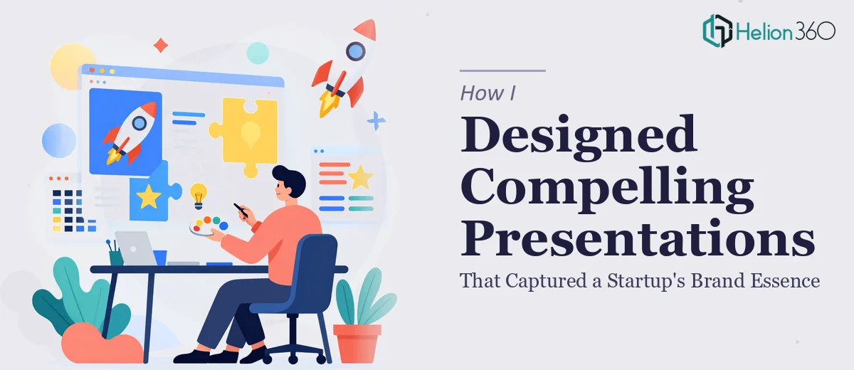
The Situation and What Was Actually at Stake
Our startup was at a pivotal moment. We had a growing content channel, a strong point of view on AI education, and a team that genuinely believed in what we were building. What we didn't have was a presentation that looked like any of that was true. Every deck we put together felt generic — the kind of thing you'd expect from a template downloaded at midnight before a meeting.
The problem wasn't effort. The problem was that our brand had a specific personality — curious, approachable, technically credible — and none of that was coming through visually. We had an upcoming series of content strategy presentations and stakeholder reviews, and showing up with mismatched slides and no visual consistency was going to undercut everything we'd worked to build.
I knew immediately this needed to be handled properly. Not patched. Not cleaned up slightly. Actually built to reflect who we are.
What I Found Out the Solution Actually Required
I did some research into what a well-executed brand presentation actually involves, and it's more layered than most people assume. The visual design of a startup presentation isn't just about making things look nice — it's about encoding your brand's character into every layout decision, color choice, and typographic call you make.
The first thing that became clear was that brand application in presentations is a discipline of its own. It's not enough to drop your logo on the title slide and use your brand colors somewhere. Real brand consistency means a defined palette (typically no more than four colors with clear hierarchy rules), a locked typographic system with specific size relationships — something like 36pt for titles, 24pt for subheadings, 16pt for body — and a grid structure that holds every slide together visually.
The second thing that stopped me was the narrative architecture. A compelling presentation for a content-driven startup isn't a collection of slides — it's a structured story. Getting from raw messaging to a coherent slide-by-slide narrative takes real editorial judgment, and that judgment has to be applied consistently across every section of the deck.
The third signal was that the execution gap between knowing what good looks like and being able to produce it is enormous without the right tools and practice.
The Work That Needs to Happen
The foundation of a strong brand presentation is structural — mapping the narrative before a single slide is touched. The right approach starts with an audit of all source material: brand guidelines, messaging frameworks, content themes, and audience context. From there, a clear story arc is built, with each slide assigned a specific job in the sequence. A well-structured presentation for a content-focused startup might run 18 to 24 slides, each carrying one idea. Getting the architecture right before visual work begins is what separates a coherent deck from a slide dump. The friction here is that most people skip this step or compress it, then wonder why the finished deck doesn't feel like it has a point.
Once the structure is solid, the visual mechanics layer on top. This means establishing a 12-column layout grid that anchors every element consistently, defining a typographic hierarchy that holds across all slide types, and restricting the palette to four brand colors with clear rules for which gets used where and at what weight. Charts and data callouts need to follow their own visual grammar — bar charts for comparisons, line charts for trends, no more than one primary insight per data slide. The challenge is that these rules interact with each other in dozens of edge cases. A designer new to this system can spend hours debugging a master slide that propagates incorrectly when content is swapped in.
Polish and brand consistency across a full deck is where most self-managed presentations break down. Every icon set needs to be from the same family, every image treated with the same color overlay or crop ratio, every transition rule applied identically. In a deck of 20 or more slides, maintaining this level of discipline requires either a precisely built master slide system or constant manual checking — both of which are time-intensive. Even experienced PowerPoint users underestimate how long it takes to audit a finished deck for consistency violations before it's truly ready to present.
Why I Brought in Helion360 to Handle It
I didn't attempt to build this myself. Once I understood what a properly executed brand presentation actually requires — the structural work, the visual system, the consistency discipline — it was obvious that the time investment alone made self-execution the wrong call.
Helion360 handled the full project end-to-end. That meant starting from our brand positioning and content strategy, building the narrative architecture slide by slide, and then executing the full visual system from grid to typography to palette. They weren't just tidying up a rough draft — they built the thing from the ground up.
What stood out was the speed. The deck was turned around quickly — done in days, not weeks — without any of the back-and-forth I expected. They came to it with the tooling already in place and the expertise already built in. That's the difference between a team that does this all day and someone learning it on the fly.
What Got Delivered and What I'd Tell Anyone in the Same Spot
What came back was a presentation that actually felt like our brand. The visual language was consistent from the first slide to the last. The narrative held together. When we used it in stakeholder reviews and internal content planning sessions, the response was noticeably different — people engaged with the material instead of squinting at cluttered slides.
Beyond the deck itself, having a properly built visual system means future presentations have a foundation to build from. That's a compounding asset for a startup that produces a lot of content.
If you're looking at a similar situation — a startup brand that deserves better visual representation than your current decks are delivering — Helion360 is the team I'd engage. They handled this end-to-end, delivered fast, and brought exactly the execution depth this kind of work requires.