

The Situation I Was Staring Down
I had multiple clients — each operating in different industries — who needed presentation decks that could take dense, research-heavy content and make it land cleanly with a non-technical audience. We're talking social media strategy reports, competitor analysis findings, consumer behavior insights — the kind of material that's genuinely valuable but almost impossible to absorb in raw form.
The stakes were real. These weren't internal working documents. They were going in front of decision-makers, investors, and marketing leads who had limited time and zero patience for walls of text. One deck that confused its audience meant a missed opportunity, a lost deal, or a strategy that never got approved.
I knew immediately that this wasn't something to cobble together over a weekend. The work needed to be done right — structurally, visually, and with enough consistency across multiple decks that each one felt like it came from the same professional hand.
What I Found the Solution Actually Required
I started by mapping out what a properly executed presentation design project actually involves when the source material is complex. What I found was that most people dramatically underestimate the scope.
The first signal of real complexity was the structural layer. Raw research findings — trend data, platform analytics, competitor breakdowns — don't arrive in presentation-ready form. Someone has to audit the source content, identify the core argument, and build a narrative arc that a slide deck can actually carry. That's not a design task. It's an editorial and strategic one, and it happens before a single slide gets touched.
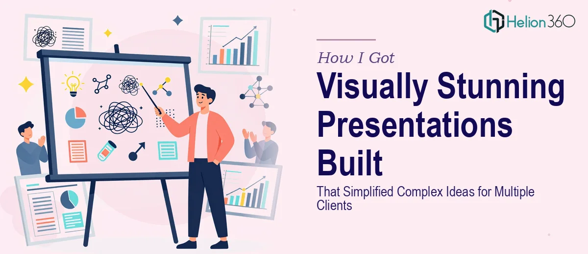
The second signal was the visual translation problem. Charts pulled from analytics tools rarely look presentation-ready. Axis labels are cluttered, color choices are arbitrary, and the chart type chosen by default is often wrong for the message being communicated. Getting data visualizations right — choosing the correct chart type, applying a clean visual hierarchy, making the insight immediately readable — requires a specific kind of judgment that takes real experience to develop.
The third signal was consistency across a multi-deck scope. When you're producing presentations for several clients simultaneously, every deck has to feel intentional and polished on its own while also reflecting a baseline of professional quality. That kind of palette discipline and layout consistency doesn't happen accidentally.
What Properly Executing This Work Actually Involves
The foundation of any well-built presentation is the structural and narrative work that happens upstream of design. The right approach starts with a full audit of the source material — research reports, analytics exports, strategy documents — and maps it against a clear story arc: what the audience needs to understand first, what evidence builds the case, and what the single takeaway per slide should be. A properly structured deck caps slide count deliberately, often targeting one idea per slide with no more than 40 words of body copy as a working rule. This phase alone takes longer than most people expect, and skipping it produces decks that look designed but communicate nothing.
Visual mechanics are where complexity compounds quickly. Done well, presentation design uses a 12-column layout grid to govern element placement, a three-level type hierarchy — typically 36pt titles, 24pt subheads, 16pt body — and a chart selection framework that matches data type to visual format. A comparison between two competitors calls for a side-by-side bar chart, not a pie. A trend over time calls for a line chart with annotated inflection points, not a table. Each of these decisions requires deliberate judgment, and executing them across 30 or 40 slides without introducing inconsistency is genuinely difficult work that trips up anyone who doesn't do it constantly.
Polish and brand consistency across a multi-deck project is its own discipline. Proper palette discipline means working within a maximum of four brand colors — primary, secondary, accent, and neutral — and applying them with a defined usage rule across every slide master. Background tints, icon weights, and divider line thickness all need to be locked to a system, not decided slide by slide. When you're producing several decks in parallel, even small inconsistencies accumulate into a result that feels amateur. Setting up master slides correctly from the start — so that global changes propagate without manual rework — is something that takes hours to configure properly the first time.
Why I Brought in Helion360 to Handle It
I didn't attempt any of this myself. Looking at the scope — multiple clients, complex source material, tight delivery windows — it was immediately clear that the right move was to engage a team that does this work every day, with the process and tooling already in place.
Helion360 handled the full project end-to-end. That meant taking the raw research content, building the narrative structure for each deck, executing the visual design from master slide setup through to final polish, and delivering presentation-ready files that required no rework on my end. The structural thinking, the chart decisions, the brand consistency work — all of it was handled as part of a single engaged scope.
What stood out most was the speed. Decks that would have taken me weeks to learn and execute properly were turned around in days. The team came with the expertise already built in — there was no learning curve billed to my timeline, no back-and-forth on fundamentals. That end-to-end execution at that pace is exactly what the situation required.
The Outcome and What I'd Tell Anyone in My Spot
What came back was a set of professionally structured, visually consistent presentation decks that each told a clear story from the first slide to the last. Complex data — consumer behavior trends, platform engagement metrics, competitor positioning maps — was translated into visuals that audiences could read and act on without needing to decode anything. The clients who received those decks moved forward with confidence.
The broader lesson I took from this is that presentation design done at a professional level is a compound skill set. It requires editorial judgment, visual mechanics knowledge, and production discipline — and those three things don't often live in the same person unless that person does this work professionally.
If you're looking at a similar scope — complex material, multiple decks, real audience stakes — and you want it handled end-to-end without spending weeks on the learning curve, Helion360 is the team I'd engage. They delivered fast and brought the kind of execution depth this work genuinely needs.