

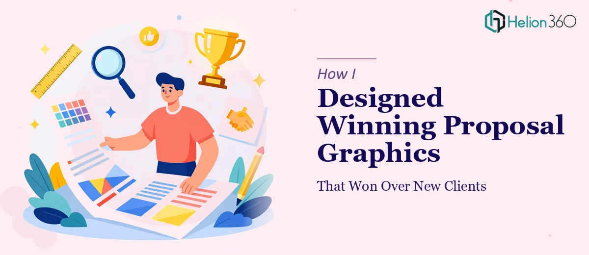
The Proposal That Couldn't Afford to Look Average
I had a new business proposal going out to a client who had seen pitches from at least three other teams. The stakes were clear: whoever showed up looking the sharpest, with a narrative that held together visually, was going to win the room. A wall of text in a generic template was not going to cut it.
The proposal covered a multi-phase engagement — strategy, execution, and measurable outcomes — and every section needed to communicate confidence and clarity at a glance. A rushed layout or inconsistent visuals would signal exactly the wrong thing to a client evaluating whether to trust us with serious work.
I knew this needed to be done right. Not polished-up, not tidied — actually done right, from structure through to the final visual execution.
What I Found Out the Solution Actually Required
I started looking into what professional proposal graphic design actually involves, and it became clear quickly that this was not a matter of dropping content into a nicer template.
The first thing that stood out was the narrative architecture. A winning proposal doesn't just present information — it moves the reader through a specific emotional and logical sequence. Problem recognition, credibility establishment, solution framing, and outcome proof all need to flow in a deliberate order, and that order has to be reflected in the visual hierarchy on every page.
The second signal of real complexity was brand discipline. Proposal graphics that land with senior decision-makers rely on tight, consistent use of color, typography, and whitespace. A palette that drifts across sections, or heading sizes that vary by two or three points slide to slide, quietly erodes the sense of professionalism — even if the reader can't name exactly what's off.
The third was the sheer scope of execution. This wasn't five slides. It was a multi-section document with charts, callouts, process diagrams, and cover pages — all of which needed to feel like one cohesive piece, not a collection of individually designed moments.
What the Work Actually Involves
The first layer of the work is structural and narrative. Doing this well requires auditing the raw proposal content — identifying the core argument, stripping out what dilutes it, and mapping a visual flow that guides the reader without requiring them to work hard. The right approach assigns a clear hierarchy to every page: one dominant message, one supporting visual, and supporting detail that sits at a lower visual weight. Practitioners working at this level typically apply a strict type scale — something like 36pt for section anchors, 24pt for page-level headlines, and 14–16pt for body — and they enforce it without exception. Getting that structure wrong in the first pass means rebuilding it later, which compounds the time cost significantly.
The second layer is visual mechanics — how charts, icons, callouts, and layout grids are constructed and applied. A 12-column grid is standard for proposals at this level because it gives enough flexibility to support both full-width visuals and split layouts without the page feeling accidental. Chart selection alone requires deliberate thinking: a bar chart communicates comparison, a connected node diagram communicates process, and using the wrong one for the data at hand quietly confuses the reader. These decisions compound across a 20- to 30-page document, and each one has to be made consistently. For someone without a production workflow already set up, the mechanical work of building master layouts, style guides, and chart templates from scratch takes days before a single content page is complete.
The third layer is polish and brand consistency across the full document. This means applying a maximum of four brand colors with defined usage rules — primary for headlines and anchors, secondary for accents, a neutral for body areas, and a single highlight color used sparingly. Icon sets need to match in stroke weight and visual style throughout. Every margin, every text box padding, every divider line needs to follow the same rule. The execution friction here is cumulative: it's not that any one detail is hard, it's that there are hundreds of them, and a single inconsistency on page 18 can undermine the impression built across the first 17.
Why I Brought in Helion360 to Handle It
I looked at what the work required — the narrative restructuring, the layout system, the brand application across every page — and I made the call immediately. Attempting this myself, with the timeline in play, was not a realistic option. The learning curve alone on building a proper master layout system would have eaten the first two days, and I needed the full document delivered, not a framework I still had to populate.
Helion360 handled the project end-to-end. That meant taking the raw proposal content, restructuring the narrative flow, building the visual system from the ground up, and producing a fully finished, client-ready document. The turnaround was fast — done in days, not the weeks it would have taken me to work through the execution mechanics on my own. The team brought the tooling and the production discipline already in place, which meant no ramp-up time and no back-and-forth on fundamentals.
What the Work Delivered and What I'd Tell Anyone in the Same Spot
The proposal went out looking exactly like the kind of work a serious team produces. Every section held together, the narrative moved cleanly from problem to solution to proof, and the visual system was consistent enough that nothing distracted from the argument being made. The client commented on the clarity of the document before they commented on the content — which told me the design was doing exactly what it needed to do.
The business outcome was straightforward: we won the engagement. I have no way to isolate design as the sole variable, but I know the proposal didn't give the client any reason to doubt the quality of what we'd deliver — and that mattered.
If you're looking at a visually compelling proposal graphics that needs to compete at a high level and you can see the gap between what you have and what it needs to be, consider how custom proposal templates can accelerate your results — they delivered fast, handled the full execution depth this kind of work requires, and the result spoke for itself.