

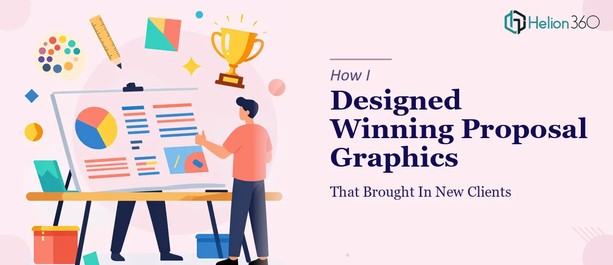
The Proposal That Had to Make a First Impression
We were putting together a proposal for a new digital marketing campaign, and the stakes were higher than usual. This was not an internal review deck — it was going in front of potential clients who had never heard of us before. The presentation had to do a lot of heavy lifting: communicate our strategy, reflect our brand identity, and make a strong visual first impression all at once.
I had the content mapped out. The strategy was solid. What I did not have was a visually compelling way to present it.
Where the DIY Approach Started to Fall Apart
I started building the slides myself. I had a rough sketch of the layout, a general sense of the color palette, and enough familiarity with PowerPoint to get something on the screen. But the further I got into it, the more obvious it became that "functional" was not going to be good enough here.
The challenge was not just making things look nice. It was about translating a marketing concept into proposal graphics that felt cohesive, on-brand, and persuasive — all at the same time. Every time I adjusted one element, something else looked off. The typography felt inconsistent. The graphics felt generic. The brand identity we were trying to establish was not coming through in the slides at all.
I spent two evenings on it and had something I was not proud to send.
Bringing in the Right Support
At that point, I reached out to Helion360. I explained the situation — a digital marketing proposal that needed professional graphic design, a brand that was still early-stage, and a tight review window. Their team asked the right questions upfront: What tone were we going for? What did we have in terms of brand assets? Who was the audience?
That intake process alone told me they understood what proposal presentation design actually involves. It is not just decoration — it is visual communication that has to align with a business goal.
What the Design Process Looked Like
Helion360 took my rough concept and translated it into a fully designed proposal presentation. They worked with the limited brand assets we had and built a visual system around them — consistent fonts, a structured color scheme, custom graphics that reinforced the campaign idea rather than just filling space.
The slide layouts were built to guide the reader's eye through the content in a logical sequence. Data points were visualized clearly. Section transitions felt intentional. The whole deck had a visual identity that reflected where we wanted our brand to go, not just where it currently was.
What struck me most was how well they balanced creative design with functional clarity. The proposal graphics were polished but not overdone. Every design choice served the content.
The Outcome
The presentation went out on schedule. The feedback from the prospective clients was noticeably warmer than what we had received from earlier pitches. More than one person commented on how clear and professional the materials looked. We moved to the next stage of conversations, which had not happened as quickly before.
I cannot attribute that entirely to the design — the strategy mattered too. But I do know that a weak visual presentation would have undermined the work we had put into the content. A well-designed proposal presentation signals that you take the work seriously, and that signal landed.
What I Took Away from This
If your proposal needs to represent a brand that is still finding its voice, the design has to work even harder. It has to project confidence and clarity before the client reads a single word. That is a specific skill — it sits at the intersection of graphic design, brand thinking, and presentation structure — and it is not something you can shortcut with a template.
Knowing when the work requires that level of craft, and acting on it, made a real difference here.
If you are preparing a client-facing proposal and the design is not matching the quality of your ideas, Helion360 is worth a conversation — they brought exactly the right combination of design skill and strategic thinking to a project that needed both.