

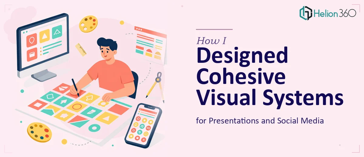
There was a point where I had two separate problems that felt like one: a presentation that needed to look polished and professional, and a set of social media images that needed to match it. On paper, both tasks seemed straightforward. In practice, keeping everything visually consistent across formats turned into a much bigger challenge than I expected.
The Problem With Designing Across Two Formats
I started by working on the presentation slides first. I had the content ready, the messaging was clear, and I had a general sense of the brand colors and fonts. But translating that into actual slide layouts — with the right hierarchy, spacing, and visual weight — took far longer than I had planned. I kept adjusting and readjusting, and the slides still did not feel like they belonged to the same visual family.
Then came the social media images. These needed to pull from the same design language as the presentation, but they had completely different dimensions, audience expectations, and visual priorities. A layout that worked on a wide slide looked cramped and unreadable on a square social post. I was essentially starting from scratch each time.
What I was really missing was a visual system — a consistent set of rules for typography, spacing, color usage, and graphic elements that could flex across formats without losing cohesion. That is harder to build than it sounds, especially when you are trying to meet a deadline at the same time.
Why Presentation Design and Social Graphics Require a Unified Approach
The two formats seem different on the surface, but they share the same core goal: communicating clearly while keeping your audience engaged. When the graphic design language is inconsistent between your slides and your social content, it sends a fragmented signal to your audience. The brand feels scattered, even if the content itself is strong.
Good presentation design and effective social media graphics both depend on intentional visual choices — not just making things look nice, but making sure every element serves the message. That means thinking about contrast, readability at different sizes, image selection, and how the eye moves through each frame. Doing this well for one format is a skill. Doing it for two simultaneously, with consistency, is a real design challenge.
After spending two days trying to make the two sets of assets feel unified and still falling short, I reached out to Helion360. I explained what I needed — a cohesive graphic design system that could work across presentation slides and social media visuals — and they took it from there.
What the Design Process Looked Like
The team at Helion360 started by reviewing the existing brand materials and understanding the context for both the presentation and the social content. They did not treat these as two separate jobs. Instead, they built a visual foundation first — a consistent set of colors, type styles, layout principles, and graphic treatments — and then applied it to both formats.
The presentation slides came back clean and structured. Each slide had visual clarity without feeling over-designed. The hierarchy was obvious, the data was easy to read, and the slides actually looked like they belonged together. The social media images used the same visual language but adapted naturally to each platform's format — the proportions worked, the text was legible at a glance, and nothing felt forced or cropped awkwardly.
Seeing the two sets of assets side by side was the clearest sign that the work was done right. They felt like they came from the same place, which was exactly what was missing before.
What I Took Away From This
The biggest lesson was that presentation design and social media graphic design are not separate disciplines — they are two expressions of the same visual identity. Treating them as isolated tasks is what caused the inconsistency in the first place.
Building a shared visual system upfront — even a simple one — saves time and produces better results. And when the scope or complexity of that work exceeds what you can execute alone, bringing in a skilled team early is far more efficient than fixing a patchwork of inconsistent assets after the fact.
If you are working on a similar project and finding that your presentation visuals and social content just do not feel like they belong together, Helion360 is worth reaching out to — they approach both formats as a connected problem, and the results reflect that.