

When One Slide Has to Say Everything
It sounds simple on paper: one slide, one message, one shot to make an impression. But when I sat down to design a single pictorial visual for our eco-friendly product launch, I quickly realized how much pressure that one slide actually carries.
We are a small startup built around sustainable living. The product launch was coming up fast, and we needed a presentation visual that could anchor the whole story — something modern and clean, but also warm, natural, and instantly recognizable as ours. Not a generic stock photo drop-in. A real, purposeful design.
The Challenge With Nature-Inspired Design
I am comfortable with basic layouts and brand assets, so I opened up the tools I knew and started experimenting. The direction was clear in my head: soft greens, organic shapes, a sense of calm. The kind of visual that makes someone feel like they are stepping outside rather than sitting through a product pitch.
But translating that feeling into a single, polished slide is a different skill entirely. Every time I tried to pull the elements together — the imagery, the typography, the spacing — something felt off. Either it looked too minimal and empty, or I overcrowded it trying to compensate. The color palette I chose kept reading as either too clinical or too rustic. Nothing hit the balance I was going for.
I also had to think about context. This was not just any internal slide. It was going in front of people seeing our brand for the first time. First impressions in a product launch presentation carry real weight, and I did not want to walk in with something that looked like a draft.
Bringing in a Team With the Right Eye
After a few rounds of failed attempts, I reached out to Helion360. I explained what we were trying to do — a single-slide eco-friendly brand visual for a product launch, clean and modern with a strong connection to nature — and shared the brand references I had been working from.
What helped immediately was that they asked the right questions before touching anything. What emotion should the viewer feel in the first two seconds? Where would this slide appear — projected on a screen, embedded in a deck, shared digitally? Should the nature element be literal or more abstract and textural?
Those questions reframed the whole design problem for me. I had been thinking about aesthetics in isolation rather than thinking about how the slide would actually land with the audience.
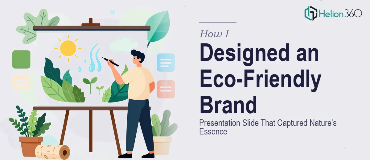
What the Final Design Got Right
Helion360 came back with a composition that used layered natural textures — think soft botanical elements and earthy tones — combined with clean sans-serif typography and generous white space. The result felt premium without being cold, and natural without being cluttered.
The visual hierarchy guided the eye exactly where it needed to go. The brand message sat clearly at the center, framed by imagery that felt intentional rather than decorative. It read immediately as an eco-friendly brand presentation slide, but it also felt modern enough to hold up next to any contemporary design standard.
The balance they struck between the pictorial visual elements and the negative space was something I had been struggling with for days. They resolved it in one clean pass.
What I Took Away From the Process
Designing for nature-inspired branding is deceptively hard. The goal is restraint — using visual elements that feel organic and unforced — but achieving that restraint takes real compositional skill. One slide for a product launch is not a smaller version of a full deck. It is its own design challenge, and it deserves the same level of intention.
The experience also reminded me that sometimes the bottleneck is not effort or time. It is the right visual instinct applied to the right brief. When the stakes are high and the brief is specific, that instinct matters.
If you are working on a single high-impact slide for a brand launch and the design keeps falling short of what you are imagining, Helion360 is worth a conversation — they have a way of seeing exactly what a visual needs to land correctly.