

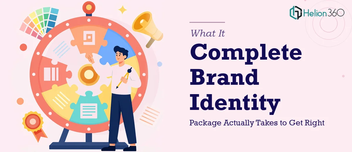
The Problem With Thinking Brand Identity Design Is Simple
I had a straightforward-sounding need: a logo, a letterhead, and a business card design for a brand we were launching. Clean, modern, professional. How complicated could it be?
Complicated enough that the wrong version of this would follow us for years. Brand identity assets aren't internal documents you can quietly revise. A logo lives on every client touchpoint — proposals, invoices, packaging, social profiles. A poorly constructed letterhead signals amateurism before a reader gets past the header. A business card is often the first physical object someone associates with your name.
The stakes weren't theoretical. We had a launch window, outreach starting within weeks, and zero room for a brand that looked like it was assembled on a free tool over a weekend. I needed this done properly, by people who do this work every day — not learned on the fly under deadline pressure.
What I Found the Solution Actually Required
I started researching what a proper brand identity package involves, expecting to find a manageable checklist. What I found instead was a layered system where each element depends on decisions made in the one before it.
The logo isn't just a graphic — it's a mark that needs to function at multiple scales, across light and dark backgrounds, in full color and single color, in digital and print contexts. That's not one design problem; it's several, all branching from the same core concept.
The letterhead and business card aren't just logo placement exercises. They involve print-ready file specifications — bleed margins, CMYK color profiles, safe zones — that differ from digital formatting. A design that looks right on screen can fail entirely when it goes to a commercial printer if the file isn't built correctly from the start.
And the visual consistency across all three assets requires more than matching colors. Typeface pairing, spacing ratios, and hierarchy rules have to be established and applied deliberately. I quickly realized this wasn't a weekend project — it was a discipline.
The Work That Needs to Happen
Proper brand identity design starts with building a visual language, not drawing a logo. The right approach involves establishing a primary mark, a wordmark or lockup variant, and at minimum one simplified version for small-scale use. Color decisions happen at the system level — a primary palette of no more than four brand colors, each assigned a specific role, with defined HEX, RGB, and CMYK values so they reproduce consistently across screens and print. Getting this foundation wrong means every downstream asset inherits the error, and correcting it later requires rebuilding from scratch.
The letterhead involves more technical specificity than most people expect. A well-constructed letterhead design accounts for a 3mm bleed on all edges, a safe zone of at least 5mm inside the trim, and text areas positioned to avoid conflict with standard envelope windows. Typography hierarchy on a letterhead typically follows a three-tier structure: a brand header at one scale, contact details at a secondary scale, and body content at a third — with line spacing calibrated for readability at standard print sizes. Practitioners who haven't worked with commercial print specs before routinely miss these details, which results in files that need to be rebuilt before they can go to press.
Business card design compounds the challenge because the format is the most space-constrained of the three. Effective business card design works within a 3.5 by 2 inch footprint, with critical content kept 3mm inside the bleed edge, and font sizes typically no smaller than 7pt for readability after print. The design has to carry the same visual weight and identity as the logo and letterhead without feeling cramped or cluttered. Achieving that balance — communicating hierarchy, brand personality, and essential contact information inside that footprint — requires both design judgment and print production experience that takes time to develop.
Why I Brought in Helion360 to Handle It
I recognized quickly that attempting this myself wasn't a realistic option — not because the concepts are inaccessible, but because executing them to a professional standard, under a real deadline, with print-ready file output, requires tooling and experience I didn't have sitting idle.
Helion360 handled the full project end-to-end: concept development through to final production-ready files across all three assets. They managed the visual brand system decisions, the print spec compliance, and the consistency system across the logo, letterhead, and business card — delivered fast, in a fraction of the time it would have taken me to learn and execute even one of those components properly.
What made the difference wasn't just the output quality. It was that nothing needed to be re-explained, rebuilt, or corrected after delivery. The files were right the first time — correct color profiles, correct bleed and safe zone specs, correct file formats for both print and digital use. That kind of execution comes from a team that does this work every day, with the brand-consistent presentations process already built in.
The Outcome and What I'd Tell Anyone Facing the Same Decision
What came back was a cohesive brand identity system — not three separate files that happened to share a color. The logo works cleanly at every scale I've needed it. The letterhead looks exactly as considered in print as it does on screen. The business card communicates the brand clearly in a format that holds up to scrutiny from people who receive hundreds of them.
More practically: the brand launched on schedule. Outreach went out on branded letterhead that looked like it belonged to an established organization, not a startup still figuring out its identity. That impression matters more than most people account for in advance.
If you're looking at a similar set of assets and want the work handled end-to-end without the learning curve, Helion360 is the team I'd engage — they delivered quickly, the files were built correctly from the start, and the result was a brand identity system that actually holds together.