

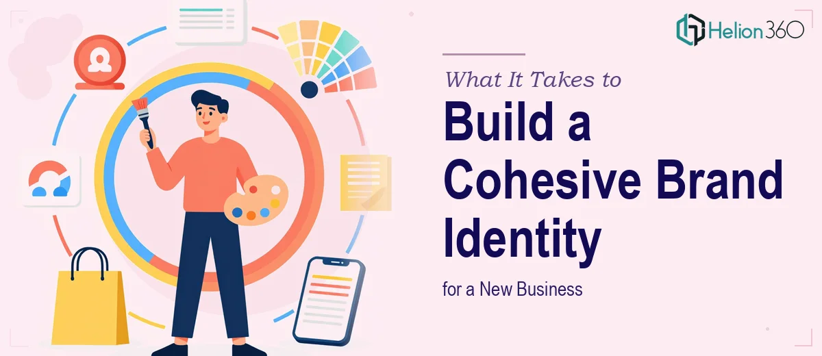
The Moment I Realized This Was More Than a Design Task
When I was getting my startup off the ground, I needed a logo, business cards, and a leaflet — the foundational pieces that would represent the brand at every first impression. These weren't internal documents. They were going to trade shows, into the hands of potential partners, and in front of people who would judge the business by how it presented itself before a single word was spoken.
I had branding guidelines roughed out and a clear sense of the direction I wanted. What I didn't have was the time, the software proficiency, or the design depth to execute it at the level the moment required. A poorly designed logo doesn't just look amateur — it signals to everyone who sees it that the business behind it isn't quite ready. That wasn't a risk I was willing to take.
What I Found the Work Actually Required
I started looking into what professional Brand Identity Design Services actually involves, and the scope became clear quickly. This wasn't a matter of picking a font and dropping in a color. A logo that works across digital screens, printed business cards, and a physical leaflet has to be built in a way that holds up at every scale and output format — which means vector-native construction, proper color space management (RGB for screen, CMYK for print), and deliberate decisions about negative space and proportion.
Business card design sounds simple until you factor in bleed zones, safe margins, DPI requirements for print, and the way type renders at small sizes on coated stock. A card that looks fine on screen can come back from the printer with clipped edges or muddy text if those mechanics aren't handled correctly from the start.
The leaflet added another layer — information hierarchy, a layout structure that guides the eye without overwhelming it, and consistent application of the brand palette across a multi-panel format. All three pieces had to feel like they came from the same family. That coherence doesn't happen by accident.
The Work That Needs to Happen
The right approach to a project like this starts with locking down the logo system before anything else is touched. A professional logo isn't a single file — it's a mark built in vector format with defined variations: a primary lockup, a stacked version, a standalone icon, and rules governing minimum size and clear space. Typography choices at this stage follow a hierarchy: a display weight for the wordmark, a complementary secondary typeface for supporting materials, and a limited palette — typically three to four brand colors with defined hex, RGB, and CMYK values. Getting this system wrong at the start means rebuilding it later, which costs far more time than doing it once correctly.
Business card design is where brand system discipline meets print production reality. The working file needs to be set at 300 DPI minimum, with a 3mm bleed on all sides and a safe zone that keeps critical content at least 5mm from the trim edge. Type on a business card rarely exceeds 9pt for body information and 12pt for the name — and at those sizes, font weight and tracking matter enormously. Thin fonts at small sizes on uncoated stock disappear. The execution friction here is that designers who work primarily in digital often miss print specs entirely, and the error only surfaces when the cards come back from production.
The leaflet brings a structural challenge that the other two pieces don't have: it has to work as a folded physical object and as a flat layout simultaneously. Panel widths need to account for fold tolerances — a tri-fold leaflet's inner panel is typically 2-3mm narrower than the outer panels to prevent buckling. Content needs to be sequenced so the reader encounters information in the right order as they unfold it. Visual weight has to be distributed so no single panel feels isolated from the rest. Applying brand colors, imagery style, and type hierarchy consistently across all panels — while making each panel readable on its own — is the kind of detail work that takes significantly longer than most people expect.
Why I Brought in Helion360 to Handle It
Once I understood what this actually required, it was obvious that attempting it myself — even with a decent eye for design — wasn't realistic given the deadline and the stakes. The technical production requirements alone (vector files, print-ready specs, color profiles, fold tolerances) were a learning curve I didn't have time for.
I engaged Helion360 to handle the full project end-to-end. They took it from brand direction through to production-ready files for all three deliverables — logo system with variants, business card in print-ready format, and a fully designed leaflet built to the correct fold specifications. The entire thing was turned around quickly, in a fraction of the time it would have taken me to learn the tooling and get to the same output quality. The team clearly does this work every day — the process was clean, the communication was direct, and the files came back ready to send straight to the printer.
What the Project Delivered and What I'd Tell Anyone in the Same Position
What I walked away with was a complete brand identity kit — a logo system that scales cleanly from a business card corner to a trade show banner, cards that came back from print exactly as designed, and a leaflet that held together as a coherent piece at every panel. The brand looked intentional and finished, which is exactly what first impressions require when you're asking people to take a new business seriously.
The thing I'd tell anyone looking at the same situation is this: the work isn't complicated to understand, but it's genuinely time-consuming to execute correctly, and the margin for error on print deliverables is zero. If you're seeing what I saw — a tight deadline, high-visibility materials, and a gap between your design knowledge and what the output actually needs — cohesive brand identity is the kind of work that demands professional attention. Helion360 is the team to engage. They delivered fast, handled every production detail, and the output was exactly what the brand needed from day one.