

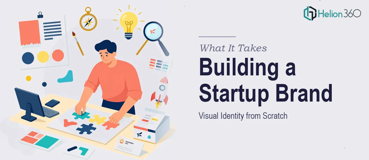
The Moment I Realized This Was More Than a Design Job
We were at an inflection point. The startup had a name, a product, and a pitch scheduled with a room full of people who would be seeing us for the first time. What we didn't have was a brand — no logo that held up at any size, no presentation deck that felt like us, and a landing page that looked like it was built in an afternoon. Which it was.
The stakes were straightforward: show up looking like a credible, serious company, or watch the first impression do permanent damage. A logo, a PowerPoint deck, and a landing page all needed to work together and reflect the same visual language — one that communicated our values and competitive position without us having to explain it in words. I knew immediately that this wasn't a task to patch together over a weekend. It needed to be done right, and it needed to be done fast.
What I Found Out This Kind of Project Actually Requires
Once I started mapping out what "done right" actually meant, the scope became clear quickly. A startup brand identity project isn't three separate tasks that happen to share a color palette. It's a system — and every element has to be designed with the others in mind.
The logo alone involves more than drawing a mark. It has to work in full color, reversed on dark backgrounds, at favicon size, and in single-color print. That means multiple file formats, multiple lockups, and documented rules for how and where each version is used. Without that, the logo falls apart the moment it leaves the designer's hands.
The pitch deck has its own layer of complexity. It needs to carry the brand system while also doing a specific communication job — telling the company story in a sequence that builds conviction slide by slide. That's a structural problem as much as a visual one. And the landing page has to translate both into a format governed by different constraints entirely: scroll behavior, hierarchy for skimming, and conversion intent layered into the layout. Seeing all three in front of me, I understood right away that attempting this without real expertise would mean getting one piece right and letting the others drift.
The Work That Needs to Happen
Proper brand identity work for a startup begins with structural decisions about the logo system. A mark that works across every application requires designing for extremes from the start — a primary lockup with the full wordmark, a compact icon-only version for small formats, and a reversed variant for dark backgrounds. The type choice has to hold at 8pt and 80pt without losing character. Most people underestimate how long it takes to get a logo to this level of completeness; getting the core mark right is one problem, and building the full usage system around it is a second project entirely.
The pitch deck layer introduces visual mechanics that need to be locked in at the master-slide level before a single content slide is built. A proper deck runs on a consistent grid — typically a 12-column layout — with a defined type scale (36pt for headlines, 24pt for subheads, 16pt for body) and a palette limited to four brand colors with defined roles for each. Applying these rules across 15 to 20 slides while also maintaining narrative momentum is where execution falls apart for most non-specialists. The grid drift, the inconsistent spacing, the one-off font size that crept in — these are the things a room full of investors will sense even if they can't name them.
The landing page requires translating the same brand system into a medium that operates on different rules. Visual hierarchy here is determined by scroll behavior and reading patterns, not slide edges. A section that works perfectly as a deck slide may need to be completely restructured for above-the-fold impact on a screen. Ensuring brand consistency across all three deliverables — logo, deck, and page — without any of them feeling like an afterthought demands someone who can hold the full system in their head while working on each individual piece.
Why I Brought Helion360 in to Handle It
I didn't spend time testing whether I could pull this off myself. The scope was clear, the deadline was real, and the cost of underdelivering was too high. What this project needed was a team that builds brand systems and presentation decks every day — one with the tooling, the templates, and the design judgment already in place.
Helion360 handled the full project end-to-end: logo design with a complete usage system, a branded pitch deck built on proper master slides with a locked grid and type scale, and a landing page laid out to reflect the same visual identity. The turnaround was fast — done in days, not weeks — and the output held together as a system. Every piece looked like it came from the same company, which was the whole point. That kind of coherence doesn't happen by accident; it's the result of a team that does this work continuously and knows exactly where the execution traps are.
What the Project Delivered and What I'd Tell Anyone in the Same Spot
The result was a brand that could stand in a room. The logo worked at every size and in every context we put it into. The pitch deck opened in front of our audience and communicated exactly what we needed it to — the design didn't compete with the message, it carried it. The landing page held the same visual standard and gave visitors an immediate sense of who we were.
More practically, walking into that first pitch with a coherent brand identity — one where the deck, the logo on screen, and the page someone would visit afterward all looked like the same company — meant we were having a different conversation than we would have been otherwise. The design wasn't the story, but it stopped being an obstacle.
If you're at the same stage — a startup that needs a logo, a pitch deck, and a landing page to come together quickly and hold up under real scrutiny — Helion360 is the team I'd engage. They delivered fast, handled the full system, and brought the kind of execution depth that this work genuinely requires.