

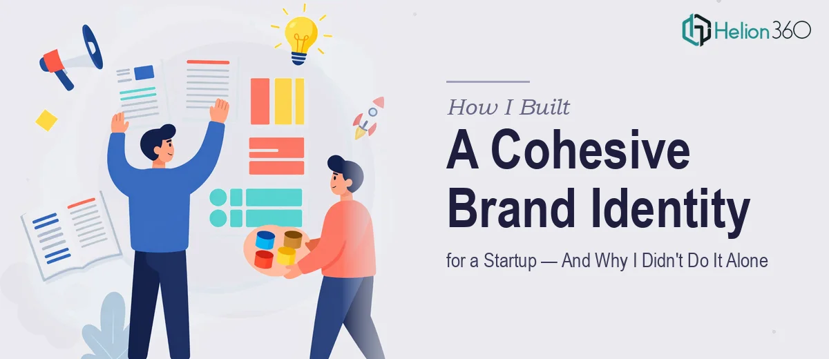
The Moment I Realized Our Brand Problem Was Bigger Than a Logo
We were a startup just past the idea stage — enough traction to need to show up professionally, not enough runway to waste time on false starts. The ask sounded straightforward: a logo, a website, some brochures, and content that pulled it all together. But the moment I started mapping out what "cohesive brand identity" actually meant in practice, I realized this was not a weekend project or a quick-fix task.
The stakes were real. We had investor conversations on the calendar, a small but growing customer base, and a team that would need to use these materials consistently for months. Getting it wrong — inconsistent visuals, a logo that didn't scale, a website that felt disconnected from the brochures — wasn't just an aesthetic problem. It was a credibility problem. I knew this needed to be done right, and done right the first time.
What I Found Out the Moment I Started Researching
I spent a few days looking into what professional brand identity work actually requires, and the scope surprised me. A logo isn't just a mark — it's a system. Done well, it needs to work across a minimum of four or five formats: full color, single color, reversed on dark backgrounds, favicon size, and print. Each version has to be technically clean as a vector file, with defined safe zones and minimum size rules so it never breaks at scale.
The website layer adds another dimension entirely. Visual brand application across a site means defined spacing tokens, a typography scale (usually three to four type roles with explicit size and weight assignments), and a color system that accounts for accessibility contrast ratios — not just what looks good on a designer's monitor.
And then the brochure and content layer has to carry all of that forward in a completely different medium. What I found signal number three: brand identity work that holds up isn't designed in isolation. It's designed as a system from the start, with every output referencing the same set of rules. That's the part most people underestimate.
The Work That Actually Has to Happen
The foundation is structural — defining the brand system before a single layout is built. This means establishing a primary palette of no more than four brand colors with precise hex, RGB, and CMYK values assigned to each role (primary, secondary, accent, neutral), and a type hierarchy where heading, subheading, and body sizes are locked — typically something like 36pt/24pt/16pt or equivalent ratios scaled to medium. Without this locked system, every subsequent deliverable drifts. Getting this right involves multiple rounds of contrast checking and rendering tests across screen and print profiles, which takes considerably longer than it appears to from the outside.
Visual mechanics come next — applying the system to actual layouts across the website, brochures, and supporting content. Web layouts built on a 12-column grid with defined gutters and margin rules keep everything proportional, but setting up master styles that propagate correctly across every page template is painstaking work. Brochure layouts add print bleed, CMYK conversion, and safe-zone discipline on top of the screen-first thinking. A practitioner working through this has to hold both contexts simultaneously, and edge cases — a headline that runs long, a photo that doesn't crop well at a given ratio — eat hours of time that are invisible to anyone watching from the outside.
Polish and consistency across every deliverable is where brand identity either holds together or falls apart. This means auditing every asset before final delivery: checking that logo placement follows the defined safe-zone rule on every page, that no off-brand color values have crept in, that font weights are consistent even where styles were manually overridden. On a project spanning a logo system, a multi-page website, a brochure suite, and content pieces, this audit pass alone can take a full day for someone who knows exactly what they're looking for — and significantly longer for someone learning as they go.
Why I Brought in Helion360 to Handle the Full Project
I looked at everything this work required and made a fast call: this needed a team that builds brand systems all day, not someone figuring it out in real time. The learning curve alone — vector file production, print-ready specifications, web grid systems, brand guideline documentation — would have cost me weeks I didn't have.
I engaged Helion360 to handle the full scope end-to-end: the logo system with all format variants, the visual identity framework that would govern the website and print materials, the brochure design built to print-ready standards, and the content pieces that needed to carry the brand voice consistently. They turned the full project around quickly — done in days, not weeks — and every deliverable arrived as part of a single coherent system, not a collection of disconnected files.
What stood out was that the execution depth was already in place. The tooling, the production workflows, the brand guideline structure — none of that needed to be built from scratch. That's the difference between engaging a team that does this work continuously and trying to assemble it yourself under deadline pressure.
What Was Delivered — and What I'd Tell Anyone in the Same Position
The outcome was a complete, production-ready brand identity: a logo system across all required formats, a defined brand guideline document, a website with consistent visual structure, print-ready brochure files, and content pieces that actually sounded and looked like the same company. When we went into those investor conversations, the materials held up — nothing felt cobbled together, and we didn't have to apologize for anything we put in front of people.
If you're a startup looking at the same scope — logo, web, brochures, content — and you've started to see how much is actually involved in doing it as a real system, the smart move is not to attempt it piecemeal. Helion360 handled the full project for us fast and with the kind of execution depth this work genuinely requires.