10Aug
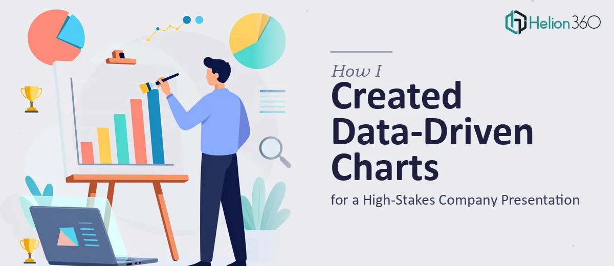
How I Created Data-Driven Charts for a High-Stakes Company Presentation
Learn how to build data-driven charts for high-stakes company presentations — from chart selection and layout to common pitfalls and polish.
Read More

Presentation design, digital marketing & market research for businesses worldwide.
Loading blog…
Learn how to build data-driven charts for high-stakes company presentations — from chart selection and layout to common pitfalls and polish.
Read More
Learn how to build a farm enterprise budgeting spreadsheet in Excel — formulas, structure, macros, and the pitfalls that trip most operations up.
Read More
Learn how to create infographics and blog visuals that translate complex data into clear, on-brand stories. A practical guide for getting the work done right.
Read More
Learn how to build a clean, accurate real estate property valuation model in Excel — formulas, data structure, charts, and common pitfalls explained.
Read More
Learn how to build a persuasive telehealth platform presentation that earns trust from investors and healthcare providers — with real design and structure tips.
Read More
Learn how to create vibrant color floor plans for marketing presentations — tools, color logic, layout rules, and common pitfalls covered in depth.
Read More
Learn how to design high-converting direct response ads for Meta platforms like Facebook and Instagram — from creative structure to CTA strategy.
Read More
Learn how to transform complex financial concepts into clear, visually engaging video presentations that hold professional audiences from start to finish.
Read More
Learn how to create high-quality LinkedIn infographics and cartoon-style illustrations that simplify complex ideas and drive real audience engagement.
Read More
Learn how to transform dense product data into compelling visual storytelling across presentation slides — with real design rules, layout strategies, and pitfalls to avoid.
Read More