

The Challenge
Marking a company's 20th anniversary is not simply a design task — it is a significant brand moment that demands both reflection and forward vision. The client needed a logo that could serve as the centerpiece of their anniversary identity: something capable of honoring two decades of achievement while simultaneously signaling strength, relevance, and ambition for the years ahead. The complexity lay in balancing nostalgia with modernity. A purely retrospective design risks feeling dated, while something too forward-looking risks erasing the legacy that makes the milestone meaningful. The logo also had to be versatile enough to function as a long-term brand asset, not just a temporary campaign graphic, meaning every design decision needed to hold up across contexts and audiences.
Our Approach
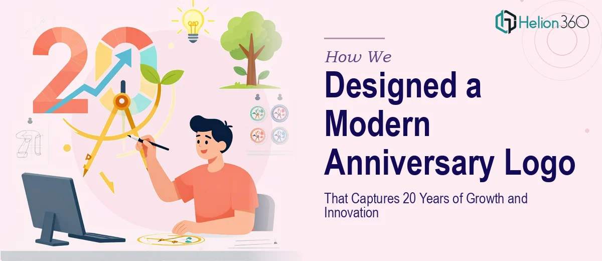
Helion360 began with a discovery phase to understand the brand's core values, visual history, and the audience it needed to resonate with. The team identified the tension between heritage and innovation as the central design challenge, and made it the creative foundation rather than an obstacle. Conceptual exploration focused on typographic and symbolic forms that could communicate longevity and momentum simultaneously — clean geometric structures that felt timeless rather than trendy, paired with thoughtful mark-making that incorporated the milestone number in a way that felt intentional rather than decorative. Colour palette selection was deliberate, drawing on the brand's established identity while introducing tonal refinements that elevated the overall presence. Multiple concept directions were developed and refined through iterative feedback, ensuring the final design was not only aesthetically compelling but also deeply aligned with the client's values and narrative.
The Outcome
The final anniversary logo delivered a cohesive visual identity built around a mark that communicates both longevity and forward momentum. The design works across digital and print applications, from event materials and social media assets to merchandise and internal communications. The client received a fully production-ready logo suite complete with usage variations and colour specifications, ensuring consistent deployment from day one. The milestone logo has been positioned as a cornerstone visual for the anniversary year and beyond, giving the brand a confident, unified face for one of its most important chapters.
Helion360 brings the same depth of strategic thinking and craft to every brand milestone — whether it's a first-ever logo or a landmark anniversary identity.