

The Challenge
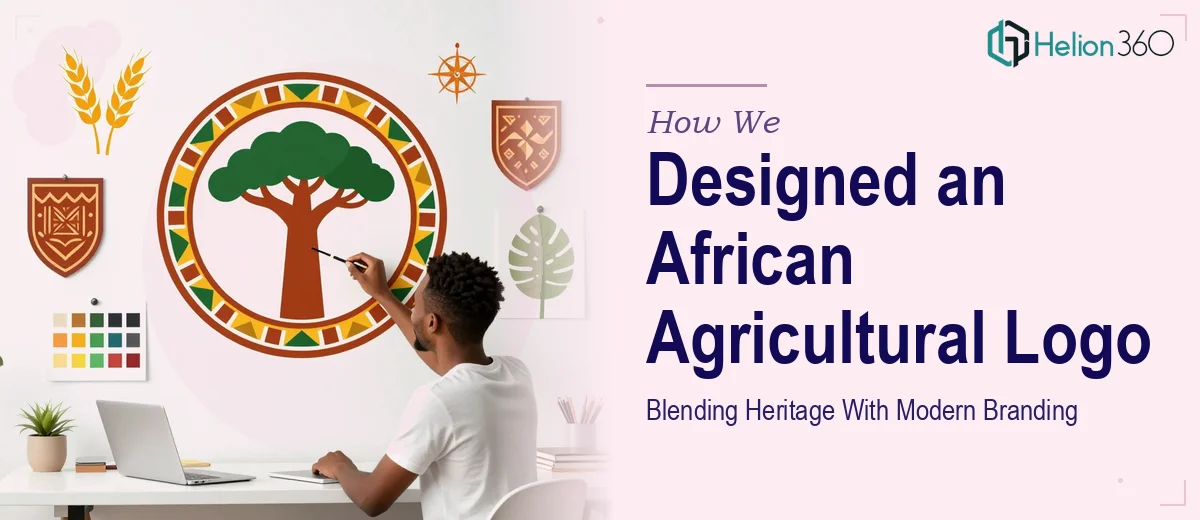
An agricultural company rooted in Africa needed a logo that could do something genuinely difficult: communicate both modern professionalism and deep cultural authenticity at the same time. The client was not looking for a generic farming mark with a wheat stalk and a green palette. They needed a visual identity that felt unmistakably African — in spirit, in symbolism, and in texture — while remaining polished enough to stand alongside international brands in a competitive industry. Striking that balance without veering into cliché or cultural misrepresentation required a designer with genuine sensitivity to African visual heritage and a firm grasp of contemporary brand strategy.
Our Approach
Helion360 began by anchoring the creative direction in research — exploring African design traditions, agricultural symbolism native to the continent, and the visual language used by modern African brands that have successfully scaled regionally and globally. The goal was to identify iconographic elements that carried authentic cultural weight without reducing them to superficial ornamentation.
From there, the design process moved through concept development focused on a mark that could work across applications — from digital profiles to physical signage and packaging. Typography choices leaned toward clean, confident letterforms that paired well with a symbol drawing on organic shapes associated with both African craft traditions and the land itself. The colour palette was chosen deliberately: earthy tones that evoked soil and harvest, elevated with a purposeful accent that communicated ambition and forward motion.
Each iteration was evaluated against a clear set of criteria: Does this feel authentic? Does it scale? Does it read as modern without abandoning its roots? Refinements were made with that lens consistently applied.
The Outcome
The final logo delivered a mark that genuinely earns the description its client asked for — sophisticated, rooted, and distinctly African. The identity holds up across formats, from small-scale business card applications to large-format display use, without losing legibility or visual impact. The client received a complete logo suite including primary, secondary, and monochrome variants, ensuring flexibility across all brand touchpoints. The result is a brand mark that positions the company credibly within the agricultural sector while proudly representing its African origin — not as a footnote, but as the defining feature of the brand.
Helion360 brings the same level of cultural intelligence and design rigour to every identity project, ensuring that logos do more than look good — they mean something.