

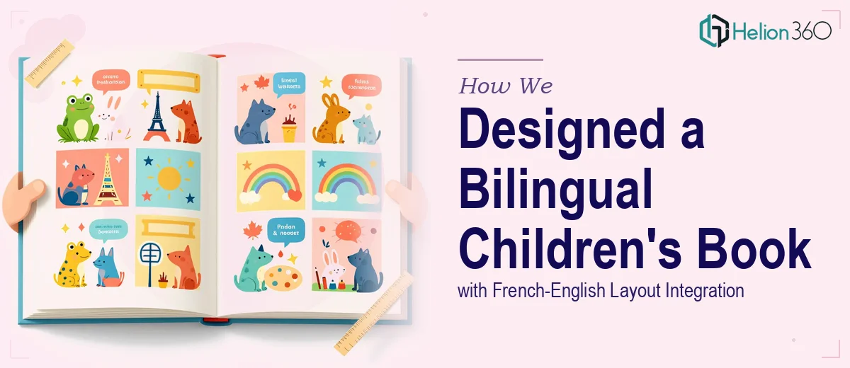
The Challenge
Launching a children's book series is already a nuanced creative undertaking — but doing so bilingually, across French and English, for readers aged 4 to 8, adds a layer of complexity that demands both design precision and genuine linguistic fluency. The client was developing an educational book series and needed more than a visually appealing layout; they needed a designer who could ensure that French-language text was accurately integrated, that the bilingual structure felt natural rather than forced, and that the overall design held the attention of young readers while clearly communicating educational content. Balancing two languages within a single cohesive layout — without the pages feeling cluttered or confusing for a child audience — required a careful, experience-informed approach.
Our Approach
Helion360 began by studying the educational content framework and the target age group to establish a visual language suited to early childhood readers. Typography choices were made with bilingual readability in mind, selecting fonts with clear letterforms that work equally well in both French and English. Page layouts were structured to present parallel language content without one language overshadowing the other, using visual hierarchy, whitespace, and colour-coded zones to guide young eyes through the material naturally.
The book cover was designed to reflect the educational theme while projecting warmth, curiosity, and age-appropriate appeal — drawing from illustration styles and colour palettes known to resonate with children in the 4 to 8 age range. French text was reviewed for accuracy and fluency throughout, ensuring that translations were not only grammatically correct but also appropriate in tone and reading level for the intended audience. Interior spreads were designed spread by spread, with consistent grid systems applied to maintain visual cohesion across the series.
The Outcome
The result was a fully designed bilingual children's book series featuring a polished cover, structured interior layouts, and seamlessly integrated French-English content — ready for print production. The design successfully balanced educational clarity with visual engagement, giving the series a distinctive look that stands out in the children's educational market. The client received print-ready files along with a consistent visual system that can be extended across future volumes in the series without losing continuity.
Helion360 brings the same attention to bilingual precision and child-centred design thinking to every educational publishing project — whether it is a single title or a full series rollout.