

The Challenge
When a new venture comes to market with a vision but no visual identity, the pressure to get the logo right is immense. This client needed more than a pretty mark — they needed something that would feel instantly recognizable, communicate strength and originality, and hold up across every medium imaginable, from a 16x16 favicon to a large-format print banner. The logo had to work on social media profile pictures, business cards, website headers, and promotional materials without losing its impact or clarity. Designing a logo that is simultaneously bold, scalable, and timeless is one of the most demanding briefs in Branding & Logo Design — there is no room for compromise at any stage.
Our Approach
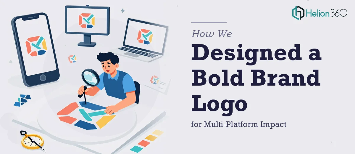
Helion360 began with a deep discovery phase to understand the client's core values, competitive landscape, and the feeling they wanted the brand to evoke. Rather than defaulting to trends, the team explored multiple conceptual directions, each grounded in the brand's personality — something cool, something hard-edged, and something with the staying power of an icon. Concepts were stress-tested at multiple scales and against real-world use cases, including dark and light backgrounds, monochrome versions, and tight crop scenarios. Each direction was evaluated not just for aesthetic appeal but for functional performance across digital and print applications. Refinements were made iteratively based on structured feedback, ensuring the final mark reflected the client's vision with precision and confidence.
The Outcome
The final deliverable was a complete custom logo system — primary mark, alternate lockups, and a monochrome version — formatted and exported across all required file types for both digital and print use. The logo passed scalability tests at every size, from app icon dimensions to billboard proportions, without distortion or loss of visual weight. The client received a production-ready brand asset that could be deployed immediately across social media, stationery, web, and physical collateral. The design struck the balance the brief demanded: distinctive enough to stand out, clean enough to age well, and structured enough to serve as the foundation for a full brand identity system going forward.
If you are building a brand from the ground up and need a logo that can carry weight across every touchpoint, Helion360 designs marks built to last.