

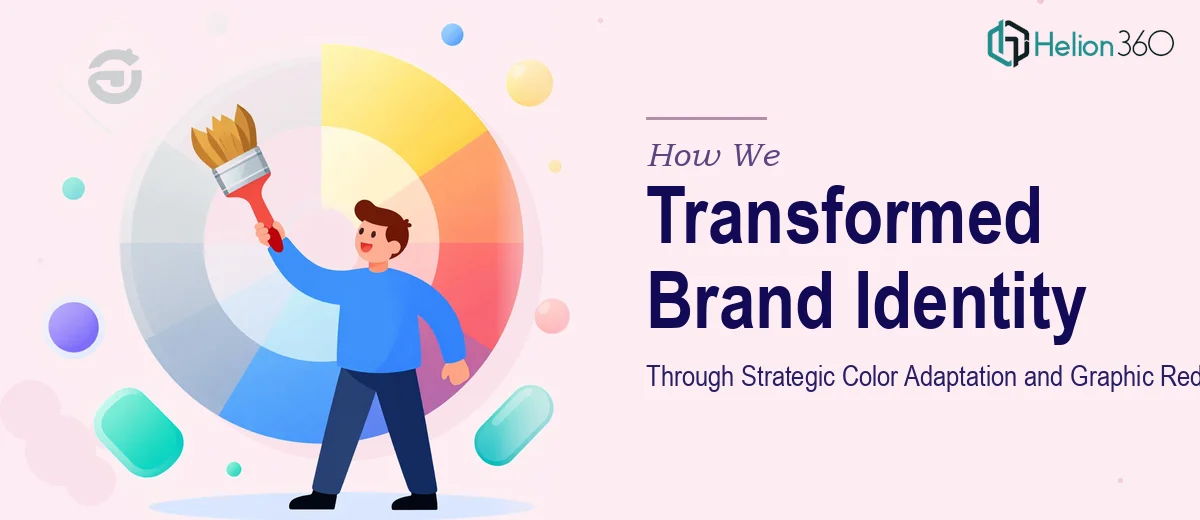
The Challenge
When a brand is in the middle of a revamp, even small visual inconsistencies can undermine the entire identity effort. This client came to us mid-rebrand with a clear but nuanced problem: their existing design assets needed color corrections to align with updated brand guidelines, and two graphics required hands-on adaptation — one involving minor modifications and another requiring a full redesign based on detailed stakeholder feedback. The complexity here was not in the volume of work, but in the precision required. Color adaptation demands more than swapping hex codes; it requires understanding how hues interact across different contexts, backgrounds, and formats to maintain brand cohesion. With a one-week turnaround and brand consistency on the line, there was no room for guesswork.
Our Approach
Helion360 began by conducting a thorough review of the client's existing brand guidelines, mapping the current design assets against the specified color palette to identify every point of deviation. Rather than applying surface-level fixes, the team analyzed each color relationship — primary, secondary, and accent tones — to ensure the adapted versions would hold up across both digital and print applications. For the first graphic adaptation, targeted refinements were made to bring the asset into full compliance with the updated guidelines while preserving the original design intent. The second graphic received a complete redesign, built from the ground up using the client's feedback as a creative brief, translating their direction into a polished, on-brand visual that felt cohesive with the rest of the identity system. Throughout the process, the team maintained close communication with the client to validate direction before finalizing each deliverable.
The Outcome
All deliverables were completed within the agreed one-week window. The client received a color-corrected asset suite that fully aligns with their brand guidelines, one refined graphic adaptation preserving the original structure with improved brand accuracy, and one fully redesigned graphic built to specification from client feedback. The result was a tighter, more consistent visual identity ready for the next stage of the client's rebrand rollout — with no rework required after final delivery.
Helion360 brings the same level of craft and brand thinking to projects of every scale, from full brand identity systems to visual identity system work like this.