

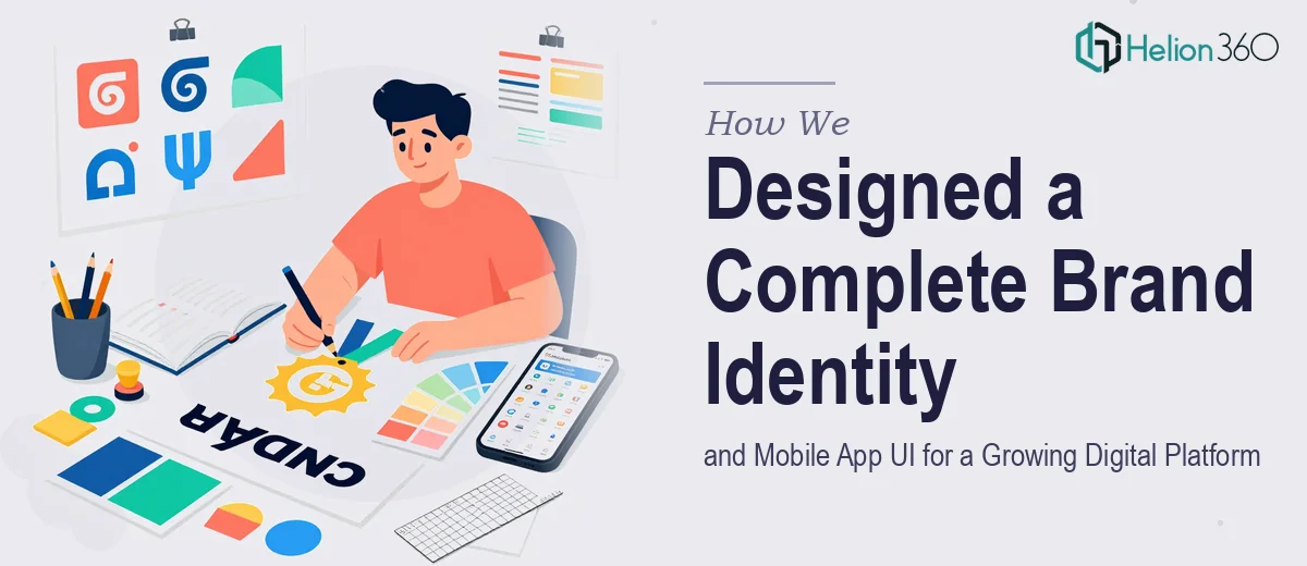
The Challenge
A fast-growing digital platform was at a critical inflection point: the product was gaining traction, but the visual identity had not kept pace. The client needed more than a logo refresh — they required a cohesive brand system built from the ground up, alongside a fully designed mobile app UI that could guide their development team through implementation. The complexity lay in executing three interconnected deliverables simultaneously — a primary logo, a comprehensive brand guide, and high-fidelity app UI screens with user flows — while ensuring every visual decision laddered up to a single, consistent creative direction. With a development team waiting on design assets and a launch timeline in motion, there was little room for misalignment or iteration delays.
Our Approach
Helion360 began by establishing the brand foundation before touching a single UI screen. The team conducted a discovery phase to understand the platform's product positioning, target audience, and competitive landscape. From there, a clean, modern logo was developed — one designed to function as a standalone visual identifier across digital and print contexts, with versatility baked in from the start.
Once the logo direction was locked, the team expanded it into a full brand guide covering color palette, typography system, and iconography standards. This document became the single source of truth for all visual communication — from social media to marketing materials to in-app elements. With the cohesive visual identity system established, the team moved into mobile app UI design, building wireframes and user flows that prioritized engagement and clarity. Each screen was designed with the brand guide in direct view, ensuring the app felt like a natural extension of the overall identity rather than a separate design exercise.
The Outcome
The engagement delivered a complete, production-ready design suite: a primary logo with usage variants, a detailed brand guidelines document, and a full set of high-fidelity mobile app UI screens complete with annotated user flows ready for handoff to the development team. The client received a cohesive visual system capable of scaling across every touchpoint — app interfaces, social media, and marketing collateral — without visual inconsistency. The brand guide in particular gave the internal team the confidence to execute future design decisions independently, reducing reliance on external input for day-to-day creative work.
Helion360 approaches brand and UI projects like this as a single, unified design challenge — because a great app UI built on a weak brand foundation will always feel disconnected. If you're building a digital product and need both the brand and the interface designed with the same creative intelligence, we're the team to call.