

The Challenge
A growing kitchen products company based in Tenerife, Spain came to us with an exciting but complex brief. Their mission — promoting healthy eating through functional, eco-conscious kitchenware — was clear, but their visual identity was not. They needed a designer who could interpret a quirky, wellness-forward brand personality and translate it into a consistent visual language spanning packaging, marketing materials, and brand identity assets. The challenge was not simply aesthetic. The brand needed to resonate with health-conscious consumers who also value style and sustainability, a discerning audience that expects both warmth and sophistication from the brands they choose. With no established design system in place, the work required building everything from the ground up while staying true to the company's spirited, approachable character.
Our Approach
Helion360 began by conducting a thorough brand discovery process, working closely with the client to define their tone, visual values, and competitive positioning within the health and kitchen space. From those conversations, a clear design direction emerged: clean and natural, with playful accents that reflected the company's personality without compromising its credibility as a quality kitchenware brand.
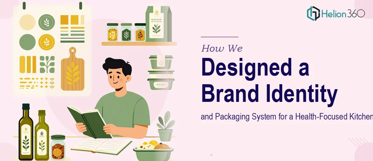
The team developed a primary logo and supporting visual identity system that included a curated color palette rooted in earthy greens and warm neutrals, a bespoke typography pairing suited to both packaging and digital use, and a suite of custom graphic elements that could flex across product labels, marketing collateral, and social media. Each packaging design was developed with eco-friendly printing considerations in mind, aligning the visual output with the brand's sustainability values. A set of brand guidelines was also produced to ensure consistency across any future design touchpoints.
The Outcome
The result was a fully realized brand identity and packaging system that gave the Tenerife-based company a confident, market-ready visual presence. The deliverables included a primary logo and logo variants, a complete brand style guide, and packaging designs for their initial product range — all cohesive in look and feel, and built to scale as the product line grows. The client received a design system that not only captured their brand's energy and health-forward mission but also gave them the tools to communicate consistently across every consumer touchpoint.
Helion360 brings the same level of strategic thinking and visual craft to every branding engagement — whether you are launching a consumer product line or refreshing an existing identity for a new market.