

The Challenge
The client needed more than just a single logo — they required a fully considered logo system capable of performing across every touchpoint of their brand. A primary logo, a secondary logo, and a submark each carry different visual weight and serve different contexts, from large-format packaging to small-scale social media profile icons and embossed business cards. The real complexity lay in ensuring all three marks felt unmistakably connected while remaining independently functional. The client also needed each asset delivered in both vector and raster formats, adaptable to multiple color environments, and built to scale without quality loss — a level of technical rigor that goes well beyond basic logo creation.
Our Approach
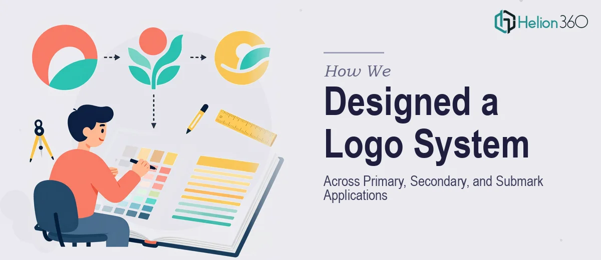
Helion360 began by anchoring the work in a deep review of the client's brand values, target audience, and the range of mediums where the logos would appear. This discovery phase shaped every creative decision that followed. The primary logo was designed first, establishing the foundational visual language — the chosen typeface, color palette, and graphic element — that would carry the brand's core identity. The secondary logo was then developed as a flexible companion, stripped to its essentials so it could hold its own in horizontal layouts, co-branded contexts, or tighter compositions where the primary mark would be too dominant. The submark came last, distilling the brand down to its most recognizable kernel — a compact, versatile badge or monogram that works at small sizes without losing character. Throughout the process, color theory and typographic hierarchy guided every refinement, and all final files were prepared in Adobe Illustrator for clean, infinitely scalable vector output alongside high-resolution raster exports in multiple formats.
The Outcome
The engagement produced a complete three-mark logo system — primary, secondary, and submark — each delivered across multiple file formats including SVG, AI, EPS, PNG, and JPEG, in both full-color and single-color variants. The client received assets ready for immediate deployment across social media profiles, business card print files, and product packaging layouts. Each mark was tested across light and dark backgrounds to confirm legibility and visual consistency at every scale. The result was a brand identity foundation that felt cohesive, professional, and genuinely built to grow with the business rather than require redesign at the next milestone.
Helion360 brings the same systematic thinking to every brand identity project — whether a client needs a single mark or a full multi-format logo suite ready for the real world.