

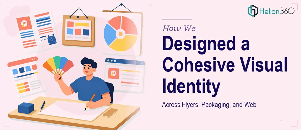
The Challenge
The client came to us with a clear ambition but a fragmented visual presence. They needed a unified design language applied consistently across multiple touchpoints — printed flyers, consumer-facing product packaging, and website graphics — all of which had to feel like they belonged to the same brand family. The complexity lay not just in the volume of deliverables, but in the nature of each medium: flyers demand immediate visual impact at a glance, packaging must communicate product appeal on shelf while meeting structural constraints, and web creatives need to be optimized for digital rendering across devices. Reconciling these distinct technical and aesthetic requirements under a single coherent visual identity system required both strategic thinking and strong execution.
Our Approach
Helion360 began with a brand alignment phase, establishing a core visual language — including color palette, typography hierarchy, iconography style, and compositional principles — before producing any individual assets. This foundation ensured that every downstream deliverable would feel intentional and consistent rather than assembled piece by piece. Flyer layouts were developed with bold visual hierarchy to drive attention and readability in high-clutter environments. Packaging designs were crafted with consumer psychology in mind, balancing brand consistency with shelf presence and tactile appeal. Web creatives and graphics were adapted from the same design system but optimized for digital contexts, ensuring visual fidelity across screen sizes and formats. Each iteration went through structured review cycles to maintain alignment with the client's brand vision while refining craft details.
The Outcome
The engagement resulted in a complete suite of brand-consistent design assets spanning print, packaging, and digital — all governed by the same visual identity framework. The client received production-ready flyer templates, finalized packaging artwork, and a set of web graphics that could be deployed immediately and extended as the brand grew. The unified system eliminated the disjointed, ad hoc appearance that had characterized their earlier materials and gave the brand a polished, professional presence across every consumer touchpoint. Teams on the client side were able to brief future creative work against a clear visual standard, reducing turnaround time on subsequent projects.
Helion360 brings the same systems-thinking approach to every multi-format design engagement — ensuring that visual consistency is never an afterthought, but the foundation everything is built on.