

The Challenge
A fast-growing technology startup based in Dubai needed a complete brand identity that could speak authentically to an Arabic-speaking audience while still projecting a modern, innovative image in a competitive regional market. The challenge was not simply translation or localization — it required a deep understanding of Arabic typographic conventions, cultural visual cues, and the aesthetic expectations of a sophisticated MENA tech audience. Generic Western-style branding would have fallen flat. The client needed design work that honored the language, felt native to the region, and simultaneously communicated the startup's forward-thinking identity to investors, partners, and customers alike.
Our Approach
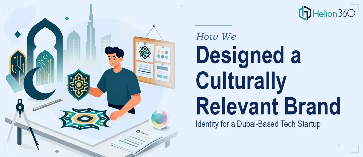
Helion360 approached this project as a cultural and creative challenge in equal measure. The team began by auditing the competitive landscape across the Gulf technology sector, identifying visual patterns that resonated with regional audiences versus those that felt imported and disconnected. From there, the design process centered on developing a logo system that worked harmoniously in both Arabic and Latin scripts — ensuring neither version felt like an afterthought. Arabic typography was treated as a primary design element rather than a functional add-on, with custom letterform treatments that balanced legibility with visual character. Brand colors, iconography, and layout principles were all developed with cultural context in mind, drawing on design traditions that carry meaning in the region without veering into cliché. All branding materials — including promotional graphics, digital assets, and brand usage guidelines — were produced to maintain consistency across touchpoints.
The Outcome
The engagement delivered a complete brand identity system tailored for both Arabic and English-language environments, including a primary logo suite, secondary mark, Arabic typography treatment, a defined color palette, and a set of branded promotional graphics ready for digital and print deployment. The startup received a cohesive visual identity that could scale with the business — credible enough for boardroom presentations and expressive enough for consumer-facing campaigns. The bilingual brand system positioned the client to engage confidently across the MENA region without sacrificing the polished, tech-forward aesthetic their sector demands.
Helion360 brings this same combination of cultural intelligence and design craft to every branding engagement — ensuring that identity work resonates not just visually, but meaningfully within its intended market.