

The Challenge
A brand preparing for a sustainability-focused relaunch needed a complete visual identity built from the ground up — one that could communicate eco-conscious values without leaning into overused green clichés. The ask was expansive: a primary logo suitable for both digital and print use, a set of approximately ten custom icons covering themes like recycling, natural elements, and sustainable living, plus a suite of social media graphics versatile enough to carry the brand across multiple platforms and campaign formats. The complexity lay not just in the volume of deliverables, but in the need for every asset to feel visually unified — speaking the same design language, drawing from the same color philosophy, and holding up consistently whether it appeared on a business card or an Instagram story.
Our Approach
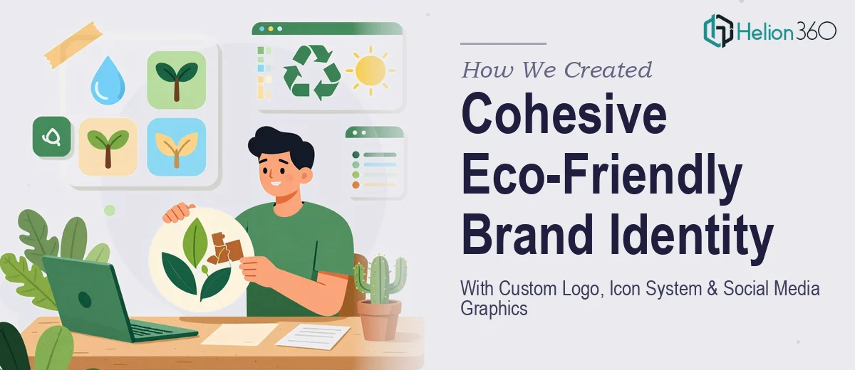
Helion360 began by establishing a visual direction rooted in nature-forward earth tones — warm greens, muted terracotta, soft sand, and deep forest hues — selected to evoke sustainability without feeling dated or derivative. The primary logo was designed with flexibility in mind, constructed so that it could scale cleanly across website headers, printed collateral, and profile thumbnails without losing its integrity. Once the logo mark and wordmark were finalized, the icon system was developed as a direct extension of that visual language, with each of the ten icons sharing the same stroke weight, corner radius, and tonal palette. Themes ranged from recycling and leaf motifs to water conservation and plant growth, giving the brand a wide symbolic vocabulary to draw from. Social media graphic templates were then templated in multiple format ratios — feed posts, stories, and banners — using the same color system and typographic hierarchy, ensuring that every piece of content published under the brand would feel intentional and on-brand. All files were delivered in high-resolution formats with fully editable source files, allowing the client's internal team to adapt assets independently going forward.
The Outcome
The engagement produced a complete, launch-ready brand identity package: a versatile primary logo with alternate lockup variations, a ten-icon system covering the full range of the brand's sustainability themes, and a set of social media graphic templates built for immediate deployment across platforms. The client received fully editable source files alongside a cohesive color and type reference, giving them both the finished assets and the tools to extend the identity over time. The result was a visual system that felt modern and considered — grounded in the brand's eco-friendly mission and ready to communicate that mission consistently from day one.
Helion360 works with brands at every stage of identity development, from first-logo launches to full visual system overhauls built around a clear strategic direction.