

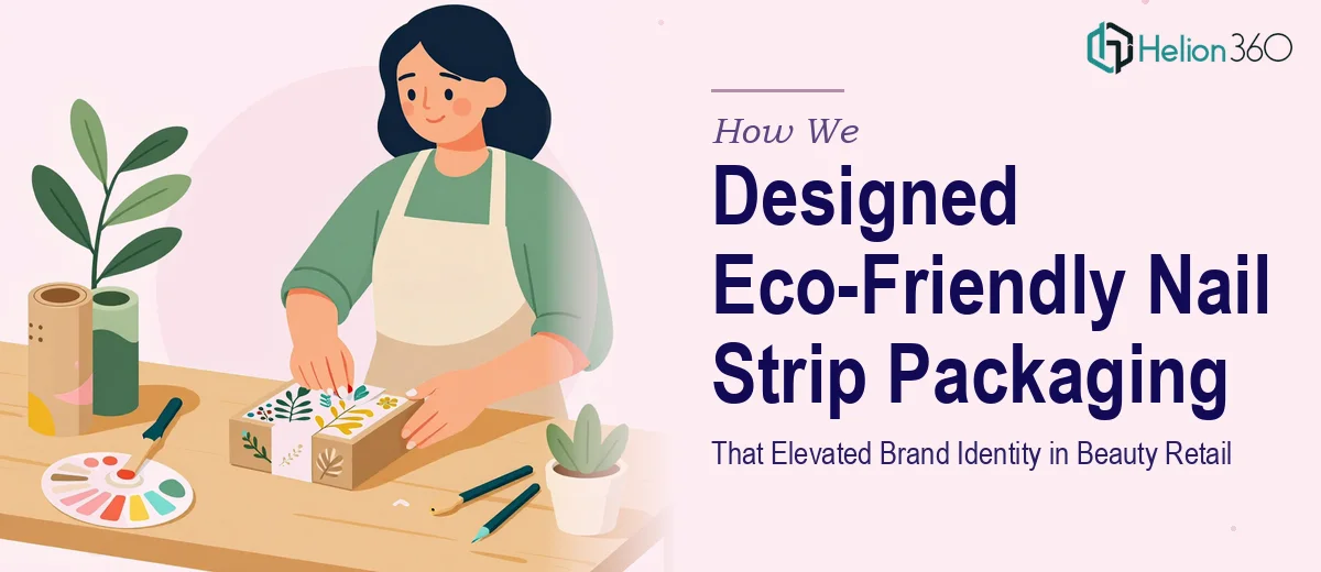
The Challenge
Launching a new line of nail strip products in the competitive beauty and wellness market requires more than a good formula — it demands packaging that earns attention at first glance and communicates brand values instantly. This client came to us with a distinctive concept: an eco-friendly nail strip range targeting modern, conscious consumers who care as much about sustainability as they do about style. The challenge was significant. The packaging needed to feel premium and visually compelling enough to compete on crowded retail shelves, while simultaneously signaling eco-conscious values without falling into the trap of dull, muted "green" aesthetics that fail to excite a beauty audience. Striking that balance — bold and beautiful, yet authentically sustainable — required a considered design approach from the ground up.
Our Approach
Helion360 began with a deep dive into the brand's positioning, target audience, and competitive landscape within the beauty retail space. Understanding who the end consumer was — style-forward, environmentally aware, and drawn to brands with a clear identity — shaped every creative decision that followed. The team developed a visual identity that blended vibrant, trend-aware color palettes with clean typographic choices and organic design motifs that subtly reinforced the eco-friendly story. Structural packaging layouts were crafted to maximize shelf impact while keeping production materials and print processes aligned with sustainability goals. Every design element was intentional: from the tactile feel communicated through visual texture choices, to the hierarchy of product information that made browsing effortless for the retail shopper. Multiple design directions were explored and refined through iterative feedback rounds to ensure the final packaging felt distinctly ownable and on-brand.
The Outcome
The project delivered a complete set of nail strip packaging designs ready for print production, covering multiple SKUs within the product line. Each design maintained visual consistency across the range while allowing individual products to stand out with their own personality — a critical requirement for retail range merchandising. The client received packaging design that communicated eco-friendly values with confidence and style, positioning the brand as a premium yet responsible choice in a saturated category. The final designs gave the brand a distinct visual identity strong enough to support broader marketing rollout, including digital and social media applications.
If you are building a beauty brand that needs packaging design to match its ambition, Helion360 brings the strategic thinking and visual craft to make your product unforgettable on shelf.