

The Challenge
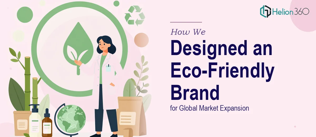
An early-stage entrepreneur was preparing to launch an eco-friendly skincare brand rooted in natural ingredients and clean beauty principles. The ambition was clear — enter international markets and resonate with a generation of health-conscious millennials and Gen Z consumers who hold sustainability to a high standard. What made this project particularly demanding was the breadth of the brief: the brand needed a logo and full visual identity system that felt simultaneously modern and organic, globally adaptable yet deeply personal, and premium enough to stand alongside established clean beauty competitors. There was no existing visual language to build from, which meant every design decision — from color palette to typography to iconography — had to be constructed from the ground up with strategic intent.
Our Approach
Helion360 began with a deep exploration of the brand's core values: nature, simplicity, and transparency. The team conducted a thorough audit of the competitive landscape in the clean beauty and skincare space, identifying white space in visual positioning that the new brand could credibly own. The design direction centered on a restrained, nature-forward aesthetic — soft botanical tones, clean sans-serif typography, and a logo mark that referenced organic forms without becoming overly literal. Every visual element was evaluated against a dual lens: how it would perform in digital environments like Instagram and e-commerce storefronts, and how it would translate into physical packaging and print materials for international markets. A comprehensive visual brand identity kit was developed, covering the primary logo, alternate logo lockups, color system, typography hierarchy, iconography guidance, and usage rules across platforms. This ensured that as the brand scaled, its visual voice would remain consistent regardless of geography or medium.
The Outcome
The final deliverable was a complete visual identity system built for a global audience. The logo — clean, versatile, and rooted in natural symbolism — was designed to work seamlessly across packaging, social media, website headers, and printed marketing collateral. The accompanying brand guidelines provided the entrepreneur with a clear, actionable framework to maintain brand consistency when working with future designers, marketers, or retail partners in new markets. The identity system positioned the brand as a credible, polished player in the premium clean beauty space from day one, giving it the visual foundation needed to attract both consumers and potential distribution partners internationally.
Helion360 brings the same strategic and design rigour to every brand identity project — whether you're launching from scratch or repositioning for a new market.