

The Challenge
A founder preparing to launch a new digital product came to us with a branding problem that many early-stage teams face: an existing logo that no longer reflected where the business was heading. The original mark felt dated in both its visual language and color approach, and it needed to evolve without losing the brand equity already attached to it. Beyond the logo refresh, the project required the creation of four distinct icon designs rooted in the company's core values — assets intended for use both as standalone icons and as UI components within the product itself. Every deliverable had to conform to an established color palette and be packaged across all the file formats required for seamless integration into digital platforms. The scope was focused but exacting, and the margin for error was narrow.
Our Approach
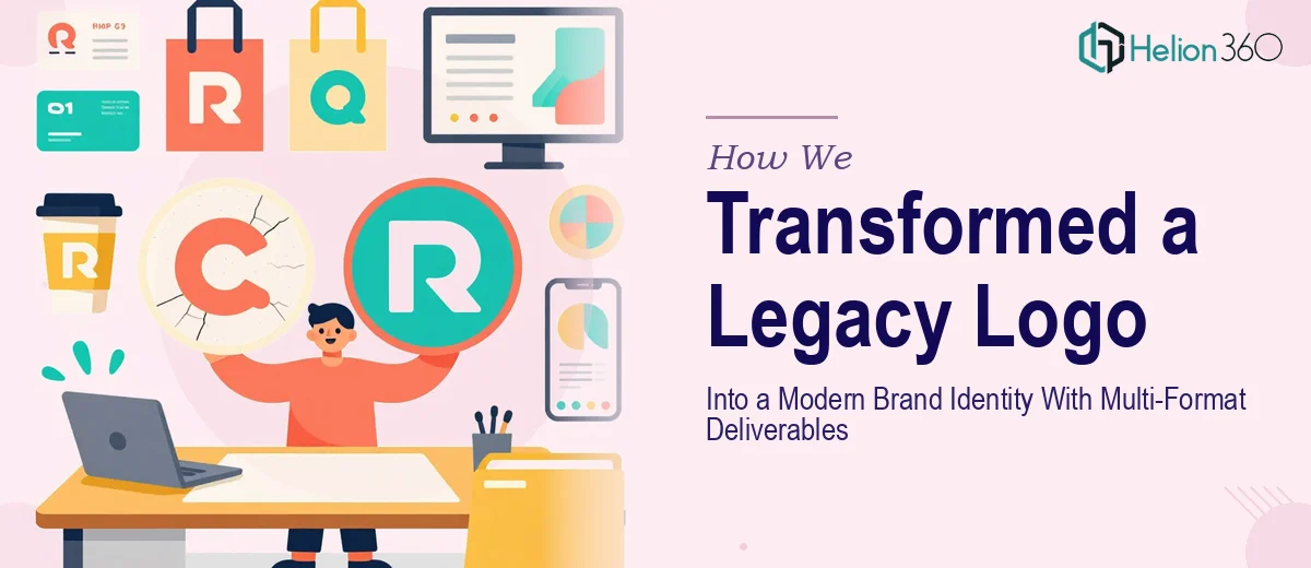
Helion360 began by analyzing the existing logo to identify which structural elements carried recognizable brand value and which were simply holding it back. Rather than discarding the original entirely, the team preserved the foundational concept while replacing its dated execution — modernizing the linework, refining the proportions, and reworking the color application to feel current and digitally optimized. Once the logo direction was approved, the team moved into icon design, developing four individual marks that each visually communicated a distinct brand value while maintaining a cohesive aesthetic system. Each icon was designed to function at multiple scales — from app interface elements to larger graphic applications — ensuring flexibility across the product's UI. The final delivery package was structured for immediate developer and designer handoff, including PNG exports at multiple resolutions, SVG vector files for scalable use, and any additional formats specified by the client's integration requirements.
The Outcome
The client received a fully modernized logo alongside four production-ready icon designs, all aligned to the brand's defined color palette and delivered in a comprehensive multi-format asset package. The refreshed visual identity gave the digital product a polished, launch-ready presence — one that communicated professionalism and brand coherence from the first touchpoint. The organized file delivery meant the development and design teams could integrate assets immediately without additional processing or reformatting. What began as a targeted logo alteration became a cohesive brand identity upgrade that positioned the product with the visual credibility it needed to compete in a crowded digital market.
Helion360 regularly supports founders and product teams at exactly this stage — when branding needs to catch up with ambition before a public launch.