

The Challenge
The client was launching a new brand and needed a logo that could do something deceptively difficult: communicate personality, professionalism, and purpose without relying on icons, illustrations, or decorative elements. The brief called for a purely typographic, sans-serif mark — clean, modern, and timeless — that would hold its own across digital and print contexts. The real complexity lay in the constraint itself. When a logo is stripped down to typography alone, every decision around letterform, spacing, weight, and proportion carries enormous weight. There is no graphic element to fall back on. The design had to be refined enough to feel intentional rather than minimal by default, and distinctive enough to stand apart in a crowded market.
Our Approach
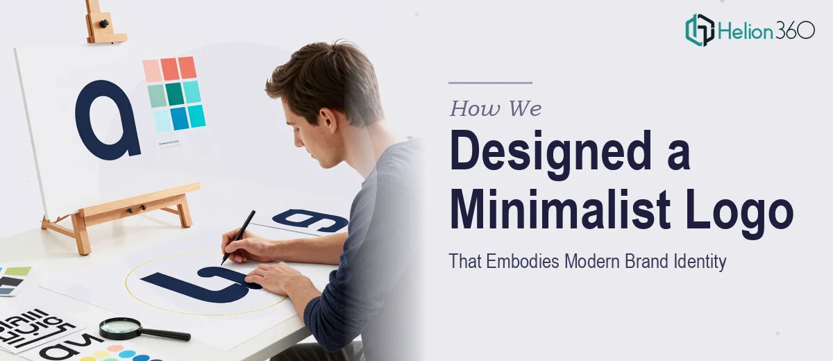
Helion360 began by auditing the client's brand language — understanding the values, voice, and audience the identity needed to speak to. From there, the team developed a typographic direction grounded in geometric and humanist sans-serif forms, exploring how different letterform treatments could introduce character without sacrificing simplicity. Multiple concept directions were developed, each testing a different balance of weight, tracking, and case treatment. The team paid particular attention to how the logotype would render at small sizes, in monochrome, and across both dark and light backgrounds — ensuring functional versatility from the outset. Refinements were driven by both aesthetic judgment and practical branding criteria, with each iteration reviewed against real-world mockup contexts including digital headers, business cards, and app icons.
The Outcome
The final deliverable was a polished, production-ready logotype built around a carefully selected and customised sans-serif typeface. The mark achieves a confident simplicity — typographically precise, visually distinct, and immediately legible across all formats. The client received the logo in full vector format with variants for light and dark backgrounds, alongside clear guidance on usage. Helion360 delivered a brand asset that feels both timeless and contemporary, giving the client a strong visual foundation to build their identity from.
If you are building a brand from the ground up and need a typographic mark that communicates with clarity and purpose, Helion360 brings the same rigour and craft to every logo engagement. Explore our Visual Brand Identity Kit to learn how we create consistent visual identities across every touchpoint.
See how we applied similar principles in our work on a modern minimal logo design and a modern brand identity system with custom logo.