

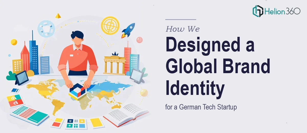
The Challenge
A growth-stage German tech startup came to us with a complex brief: create a brand identity — name and logo — that could resonate simultaneously across Turkey, Europe, North America, and South America. The challenge was not simply visual. It demanded a brand system that could carry cultural neutrality and commercial appeal across vastly different markets, while still projecting the clarity, innovation, and confidence expected of a European tech company. The startup was entering a competitive global landscape with no existing visual identity, which meant every decision — from naming logic to color palette to typeface selection — had to be made with international scalability in mind from day one.
Our Approach
Helion360 began by mapping the target markets against shared brand perception values: what reads as trustworthy in Turkey, what signals innovation in Germany, and what communicates ambition in the Americas. This cultural brand audit informed every creative direction before a single concept was sketched. The naming exploration focused on short, phonetically accessible constructs that could work across Latin-script languages without awkward translations or negative connotations in any target region. On the visual side, the team developed multiple logo directions grounded in rigorous color theory and typographic hierarchy, testing each concept against both digital contexts — app icons, social media, web — and print applications such as stationery and event materials. Final concepts were stress-tested for scalability, ensuring the mark held up at small sizes and in single-color environments. The chosen direction balanced geometric precision with a sense of forward motion, reflecting the startup's ambition without anchoring it to any single cultural aesthetic.
The Outcome
The engagement delivered a complete foundational brand identity: a refined brand name, a primary logo mark with supporting horizontal and stacked lockup variants, a curated color system, and a typography pairing suited for both digital interfaces and printed collateral. The client received a brand that functions cohesively across five distinct regional markets without requiring localized redesigns. The visual identity was built to scale — ready for pitch decks, product interfaces, trade show materials, and digital advertising from day one of launch.
Helion360 approaches multi-market brand projects with the same rigor as enterprise design work — if you are building a brand that needs to travel across borders, we can help you get it right from the start.