

The Challenge
A sustainable energy tech startup came to us with a well-defined brand concept and a clear sense of identity — innovation, sustainability, and forward momentum — but no visual language to express it. The challenge was not simply designing a logo; it was translating an abstract but precise set of brand values into multiple distinct visual directions, each capable of standing on its own while remaining true to the startup's mission. The client needed five to seven unique concepts delivered within a two-week window, with enough creative range to facilitate a meaningful selection process without drifting into visual noise or inconsistency. Balancing creative breadth with brand discipline in a tight timeframe required both strategic thinking and design precision.
Our Approach
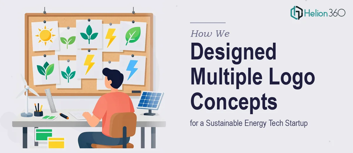
Helion360 began by conducting a focused brand discovery phase, mapping the client's values — clean technology, sustainability, and innovation — against current visual trends in the energy and tech sectors. Rather than defaulting to obvious green-leaf iconography, the team explored a spectrum of design territories: geometric mark-making inspired by energy flows and circuits, typographic wordmarks with progressive letterform treatments, and hybrid logomarks that fused natural and technological motifs. Each concept was developed with a distinct visual philosophy, ensuring the client could evaluate genuinely different directions rather than minor variations of the same idea. Every concept was presented in context — across light and dark backgrounds, at multiple scales, and in both color and monochrome — to give the client a realistic view of real-world application before making a final decision.
The Outcome
By the end of the two-week engagement, six fully realized logo concepts were delivered, each accompanied by a brief rationale explaining the design thinking and intended brand positioning behind the mark. The client was able to identify a clear preferred direction quickly, and one concept moved forward into the refinement stage. The final logo successfully captured the startup's dual identity as a technology company and sustainability advocate — clean, professional, and visually differentiated in a crowded sector. The refined mark was delivered in all required file formats, ready for deployment across digital platforms, printed materials, and pitch presentations.
Helion360 brings the same structured creative process to every branding engagement — ensuring that logo exploration is purposeful, not arbitrary, and that the final mark is built to grow with the brand. Learn more about how we've created visual identity systems that align startup values with distinctive design.