

The Challenge
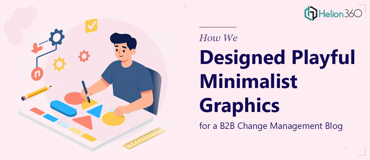
A B2B change management blog needed a steady supply of custom graphics that could do something genuinely difficult: feel playful without sacrificing professionalism. The content covered serious organizational topics — transformation, leadership shifts, process change — yet the brand's personality called for visuals that were light, accessible, and distinctly non-corporate. The challenge was not just creating one strong graphic, but building a repeatable visual language that could scale across an ongoing content calendar, stay consistent with the brand, and land with a B2B audience accustomed to dry, template-driven design. Tight turnaround times added further pressure, as new blog posts were being published regularly and each piece required a fresh illustration.
Our Approach
Helion360 began by thoroughly analyzing the blog's existing content, tone, and brand personality to establish a clear visual framework before a single asset was produced. The goal was to define a style system — consistent in color palette, line weight, character style, and compositional logic — so each graphic felt like part of a cohesive series rather than a one-off illustration. Once the visual language was locked in, the team moved into a production rhythm suited to the blog's publishing cadence. Each graphic was designed to reduce complex change management concepts into a single, instantly readable visual metaphor — communicating the post's core idea without competing with the editorial content itself. Feedback loops were kept short and structured, allowing for quick iteration without disrupting delivery timelines.
The Outcome
The result was a library of playful, minimalist blog graphics that gave the publication a distinctive visual identity in a crowded B2B content landscape. Each illustration reinforced the post's message while reflecting the brand's approachable personality — making dense organizational content more inviting to read. The consistent visual system meant that as new posts were published, new graphics could be produced efficiently without sacrificing quality or coherence. The blog's visual presence became a recognizable part of its editorial brand, helping it stand out in channels where most B2B content defaults to stock photography and generic iconography.
Helion360 brings the same systematic thinking and creative rigor to every ongoing content engagement — building visual languages that scale with your publishing needs rather than starting from scratch each time. See how we've applied this approach to presentation slide design for content creators and pitch deck design for startups.