

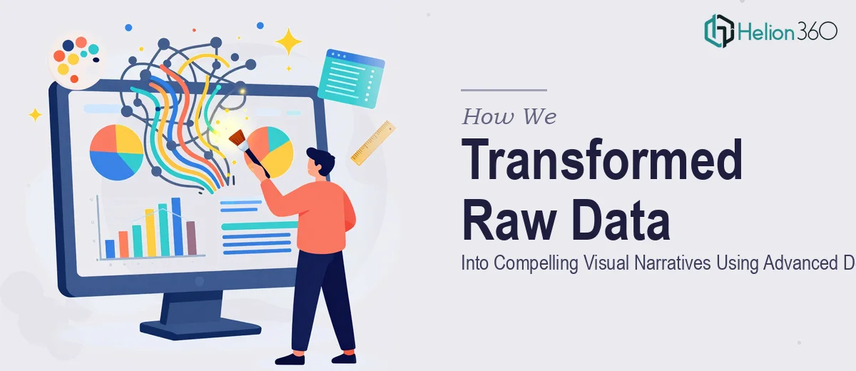
The Challenge
The client's team depended on clear, visually compelling data representations to communicate key insights, trends, and performance metrics to internal and external stakeholders. Despite having access to rich data, translating that information into graphics that were both accurate and visually engaging had become a persistent bottleneck. The work required someone who could interpret detailed creative briefs rapidly, work fluently across both Canva and Photoshop, and deliver production-ready assets — including PNGs, SVGs, and PDFs — within tight turnaround windows. Generic chart templates and off-the-shelf tools were falling short. What the client needed was a design partner who could bring genuine craft and strategic thinking to every visualization assignment.
Our Approach
Helion360 began by conducting a thorough review of the client's existing visual language, briefing documents, and the range of chart and graphic formats they typically required. Rather than applying a one-size-fits-all template, the team developed a flexible visual framework that could accommodate data-heavy infographics, trend line charts, comparison graphics, and summary dashboards — all while maintaining a consistent and polished aesthetic. Each asset was built to match the client's specified style guidelines, with careful attention to typographic hierarchy, color logic, and data labeling accuracy. Our explainer visual design services apply this same strategic approach to simplify complex information. Photoshop was used for more complex, layered compositions requiring pixel-level precision, while Canva facilitated rapid iteration on standardized formats. Communication throughout the process was structured and proactive, with questions clarified early to prevent rework and ensure every deliverable matched the intended message.
The Outcome
The engagement produced a substantial library of on-brand data visuals, including charts, graphs, and infographics delivered across multiple formats suitable for presentations, reports, and digital publishing. Each asset was handed off in the client's preferred file format — including vector-ready SVG and high-resolution PNG outputs — ensuring seamless integration into their existing workflows. The client's team reported a marked improvement in how stakeholders engaged with their data-driven communications, with visuals that now conveyed complex information clearly and credibly. Similar results have been achieved through narrative-driven pitch documents that transform complex concepts into compelling visuals. The project demonstrated that thoughtful design execution, grounded in a deep understanding of the data and the audience, makes the difference between information that informs and information that persuades.
Helion360 brings the same level of craft and communication discipline to every data visualization engagement, regardless of scale or complexity. See how we've applied these principles to investor pitch visuals and other high-stakes communications.