

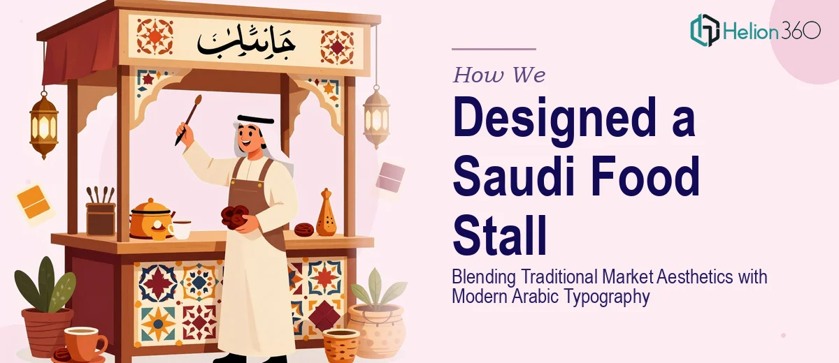
The Challenge
Creating a visual identity for a Saudi food stall is a task that demands far more than decorative flair — it requires a deep understanding of cultural context, Arabic typographic conventions, and the visual language of traditional Gulf markets. The client needed a cohesive design system that could communicate authenticity to a local audience while remaining legible, inviting, and commercially effective across multiple touchpoints: menus, signage, banners, and stall-facing collateral. The added complexity was the need to treat Arabic text as a primary design element rather than an afterthought, which rules out most generic branding approaches and demands genuine fluency in right-to-left composition and Arabic script aesthetics.
Our Approach
Helion360 approached this project as a full brand identity engagement rooted in cultural research and typographic craft. The process began with a visual audit of traditional Saudi souq and market graphics, drawing reference from historical market signage, regional color palettes — earthy terracottas, deep saffron, and warm whites — and the geometric ornamentation found in classic Najdi and Hejazi design traditions. This historical grounding was then layered with contemporary Arabic display typography to produce a visual system that felt both familiar and fresh to the target audience.
Design deliverables were developed with the physical stall environment in mind. Menu layouts were structured to accommodate Arabic-primary text with clear hierarchy and food category flow. Banners and signage were designed for high-contrast legibility at distance, using bold calligraphic headline treatments paired with clean body type. Each element was reviewed for cultural accuracy, ensuring that the Arabic copy, layout direction, and visual symbols aligned authentically with Saudi market traditions rather than relying on generic Middle Eastern design tropes.
The Outcome
The engagement produced a complete visual identity suite for the food stall, including a primary logo mark, a bilingual menu layout, promotional banners, and a suite of stall signage — all designed with Arabic as the lead language and cultural authenticity as the guiding principle. The resulting identity captured the warmth and energy of a traditional Saudi marketplace while presenting the brand with the visual polish expected of a modern food retail experience. The client received a design system ready for immediate physical production, with assets sized and formatted for print across all key stall touchpoints.
Helion360 brings the same level of cultural precision and typographic rigor to every brand identity project, whether the work calls for Arabic fluency, regional market expertise, or both.