

The Challenge
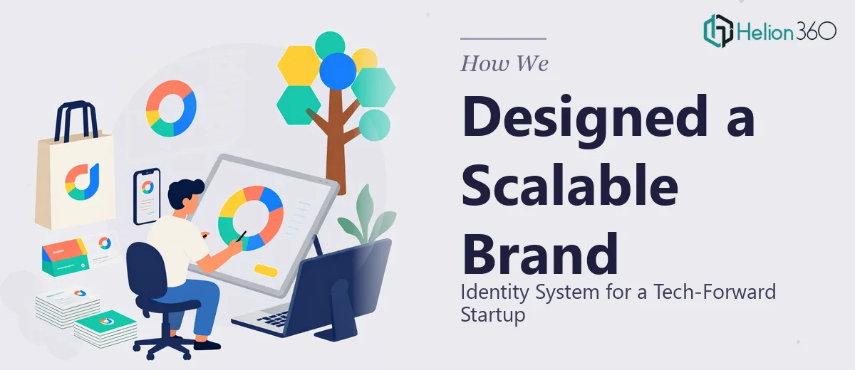
A technology-driven startup approaching its brand launch needed more than a single logo — it needed a complete visual identity system built to flex across every touchpoint. The client had a clear sense of direction: modern, edgy, sophisticated, and unmistakably tech. But translating that vision into a cohesive set of logo variations — each serving a distinct purpose while maintaining a unified aesthetic — required both strategic thinking and refined design execution. The brief called for three distinct logo formats: a clean icon-only mark, a wordmark with the company name prominently featured, and a lockup that integrated the tagline. Each version had to work seamlessly across digital platforms and physical print media, meaning scalability, color integrity, and typographic precision were non-negotiable from the start.
Our Approach
Helion360 opened the project by conducting a deep-dive into the startup's positioning, competitive landscape, and target audience to ensure the visual direction was grounded in brand strategy rather than aesthetic preference alone. The design team established a bold yet professional color palette — one that balanced high-energy tech vibrancy with the kind of reliability that builds trust in a crowded market. Typography was selected to reinforce the contemporary edge the client was after, with clean geometric forms that hold up at any scale. From there, the three logo variations were developed in parallel so each format complemented the others rather than feeling like an afterthought. The icon-only mark was refined for maximum impact at small sizes and app icons, the wordmark was crafted for strong brand recall across presentations and marketing collateral, and the tagline lockup was designed with enough visual breathing room to keep the messaging legible without cluttering the composition. Every variation was tested across both light and dark backgrounds, ensuring full versatility before final delivery.
The Outcome
The client received a complete three-logo brand identity system — icon mark, wordmark, and tagline lockup — each delivered in full vector format, production-ready for both digital and print applications. The final suite was accompanied by guidance on color usage and clear space, giving the startup's internal team the tools to deploy the brand consistently from day one. The resulting identity strikes the precise balance the client envisioned: bold enough to stand out in a competitive tech landscape, refined enough to command professional credibility in investor and partner conversations.
Helion360 brings the same level of strategic and creative rigor to every brand identity engagement — whether it is a modern, scalable logo or a complete brand identity system rebuild.