

The Challenge
An emerging organic snack and natural beverage company was preparing to launch into one of the most visually competitive retail categories in consumer goods. The food industry is saturated with brands vying for shelf attention, and standing out demands more than a clean logo — it requires a cohesive identity system rooted in a clear brand story. The client needed a designer who could translate their values around sustainability, clean ingredients, and health-conscious living into a visual language that would resonate with modern consumers. The added complexity was a tight timeline, a brand still early in defining its voice, and the expectation that the final output would span the full breadth of brand touchpoints — from logo to packaging to overall visual identity.
Our Approach
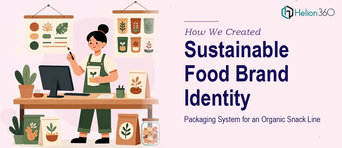
Helion360 began with a deep discovery phase, reviewing the client's product line, target audience, and competitive landscape to identify white space in the organic food category. The design team developed an overarching brand concept rooted in natural textures, earthy but vibrant color palettes, and typography that communicated both warmth and trustworthiness. The logo was designed with versatility in mind — built to work seamlessly across packaging labels, digital platforms, and retail signage. From there, the team developed a full packaging system for the snack and beverage range, applying consistent structural design logic while allowing each product variant its own visual identity within the broader family. Sustainability cues were woven into every design decision, from the use of organic-inspired illustration styles to material-conscious layout choices that acknowledged eco-friendly printing. The client's evolving concepts and early-stage ideas were refined through collaborative feedback cycles, ensuring the final direction reflected their vision while benefiting from professional design expertise.
The Outcome
The engagement delivered a complete brand identity and packaging system ready for production and retail launch. The client received a primary logo suite with variations, a defined color system and typography hierarchy, packaging designs across multiple SKUs for the snack and beverage lines, and a set of brand guidelines to maintain consistency as the business scaled. The visual identity successfully captured the intersection of sustainability and approachability — positioned to appeal to health-conscious consumers in a premium organic market segment. The packaging system was built to be modular, allowing new product additions to be introduced without disrupting the visual cohesion of the line.
Helion360 works with food and consumer brands at every stage of growth — from pre-launch identity builds to full packaging system overhauls.